
Variant and Collection Consistency Review
A side view may show the quarter panel carrying the dominant color while the top view reveals that the same color also covers most of the tongue and eyestay. The variant then reads differently from the intended blocking diagram: balanced from the side, concentrated from above.
That is a sneaker colorway consistency issue, but only a visual one. The render cannot establish how a physical material will reproduce the color, respond to light, age, transfer dye, or behave during manufacturing.
A useful review keeps two questions separate:
- Does each concept-stage image express the intended variant logic?
- Which decisions remain unresolved until material sampling and physical evaluation?
That separation prevents concept approval from being mistaken for product approval.
Consistency Preserves Intent, Not Identical Paint
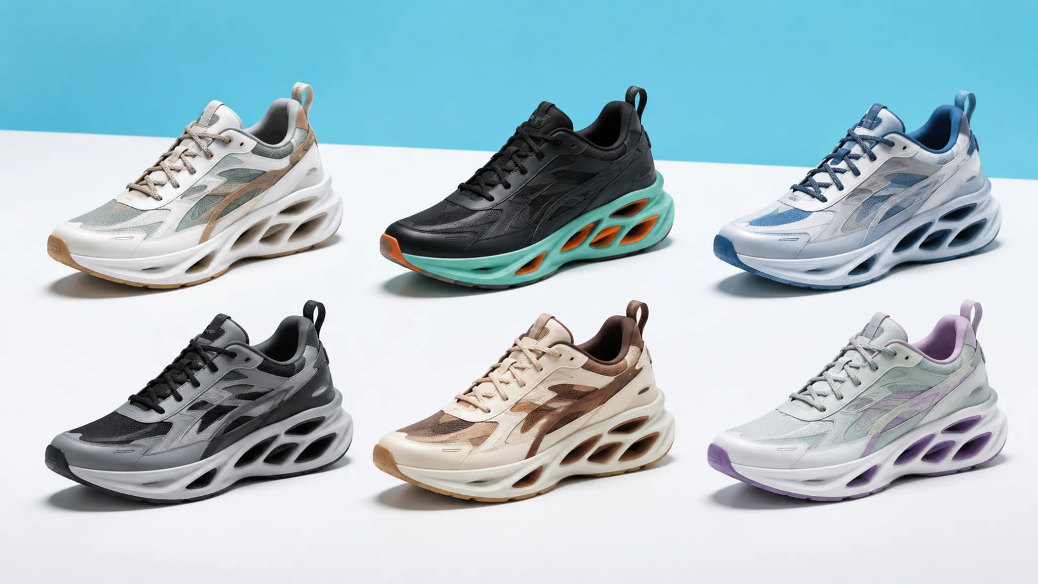
A coherent collection can vary hue, value, tone, contrast, and accent placement. Consistency comes from preserving the intended relationships among those changes.
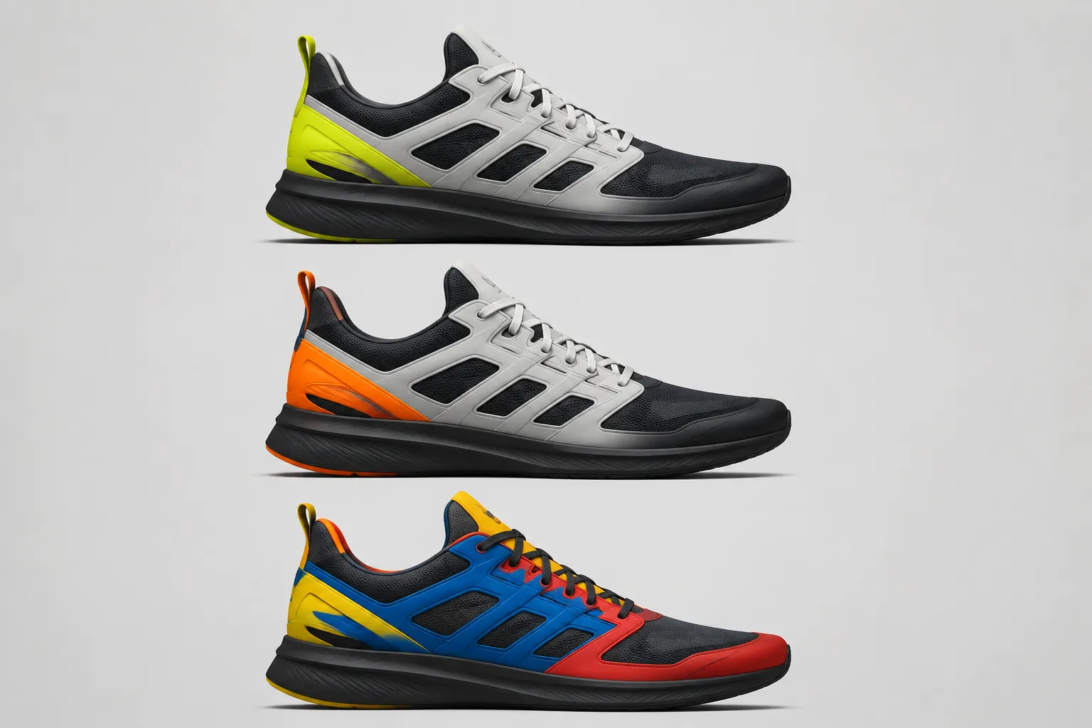
Consider two hypothetical concepts built on the same sneaker silhouette. Variant A uses a dark base, a light overlay, and a bright heel accent. Variant B changes all three hues but preserves their roles and approximate proportions. The collection logic remains visible even though the colors differ.
Now compare a third concept using the same palette as Variant A. If its bright accent spreads from the heel into the quarter, tongue, and eyestay, repeated colors no longer guarantee consistency. Panel allocation and visible proportion have changed the hierarchy.
Sameness repeats values; consistency preserves intent.
Identify what should remain stable before judging what has changed. The stable element might be the blocking map, the location of the highest contrast, the relationship between base and overlay, or the treatment of a recurring collection accent. Without that decision, feedback tends to collapse into personal preference.
Start With Upper Zoning
Upper zoning gives the review a shared map. It separates the sneaker into visible areas that can be compared across variants and views.
A working review map may include:
- Toe and forefoot
- Vamp
- Mudguard or lower overlay
- Quarter or side panel
- Eyestay
- Tongue
- Collar
- Heel counter area
- Branding or graphic zones
- Midsole and outsole
- Small hardware and trim
Record the visual role assigned to each zone. A panel might carry the base, support the main field, separate adjacent forms, hold a focal accent, or provide a low-emphasis transition.
Compare roles before comparing color names.
For every variant, ask whether corresponding zones still perform their assigned role. A quarter panel need not use the same hue throughout the collection, but an unexplained shift from quiet base to dominant accent changes the variant logic.
Zoning also exposes accidental grouping. Adjacent overlays may merge when their values are too similar. A high-contrast seam or trim treatment may split an area intended to read as one continuous form. The render shows the resulting visual grouping; it does not prove that every visible line corresponds to a feasible component, seam, or material boundary.
Review Color Proportion and Visual Force
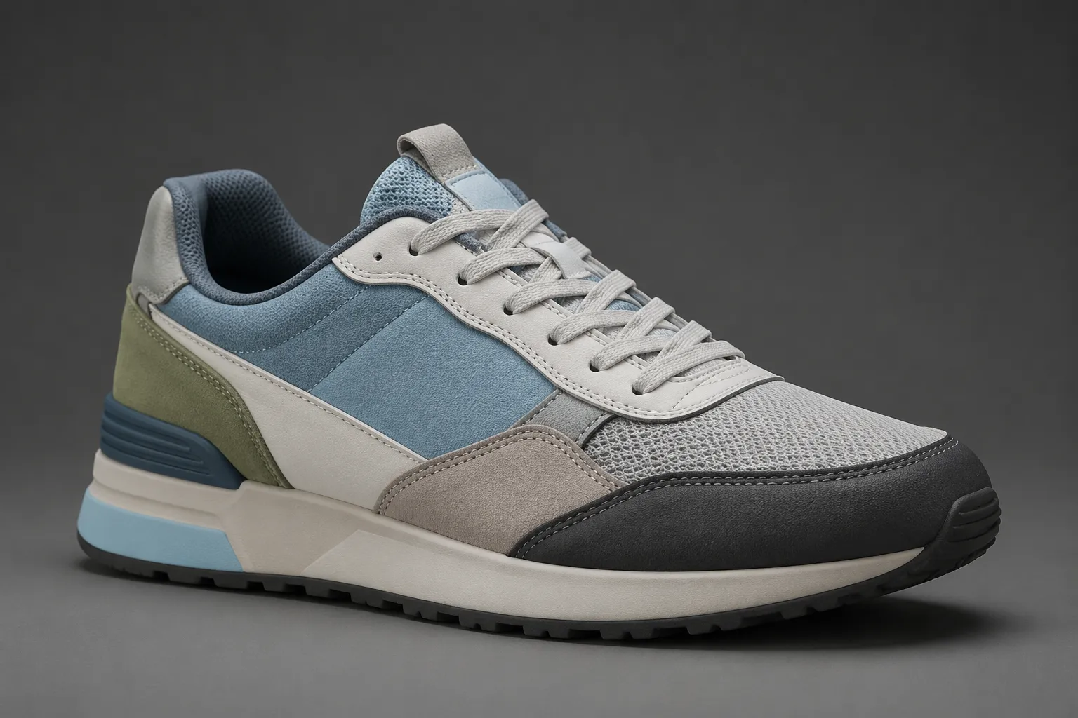
A palette list records which colors are present. It does not show how much visual area each color occupies or how strongly it attracts attention.
The same three colors can produce different silhouette reads. A bright color limited to a heel tab behaves differently from that color covering the rear quarter. A dark outsole may appear minor in a top view but become a strong horizontal band in profile.
Use comparison labels such as:
- Dominant: carries the largest or most visually forceful area
- Supporting: establishes the main relationship around the dominant color
- Accent: directs attention to a limited zone
- Separator: clarifies boundaries between adjacent forms
- Neutral: reduces competition or connects the palette
These are review labels, not measured production specifications. Their purpose is to show whether each colorway follows the approved visual hierarchy.
Small areas can still dominate.
A narrow accent may command attention because of contrast, saturation, position, or repetition. Review visible force as well as surface area. If a small mark becomes the first thing seen in every view, it is functioning as a primary focal point regardless of its size.
Contrast Can Redirect the Design Story
Contrast determines which construction cues become prominent. Changing contrast can therefore change more than mood.
Suppose a hypothetical collection intends to emphasize a sculpted heel form. One variant places its strongest light-dark contrast around the heel, while another moves that contrast to the forefoot overlay. The second variant may remain coherent in isolation, but it tells a different visual story.
Inspect contrast between:
- Base and overlays
- Upper and sole
- Logos or graphic marks and their surrounding panels
- Stitching, edges, and adjacent materials
- The sneaker and its background
Background contrast deserves separate attention. A campaign mockup can make a subdued upper appear more vivid or cause an edge to disappear. The shift may come from composition, lighting, or post-processing rather than from the colorway specification. The review record should distinguish the shoe's intended color relationship from the presentation conditions surrounding it.
Check Colorway Consistency Across Views
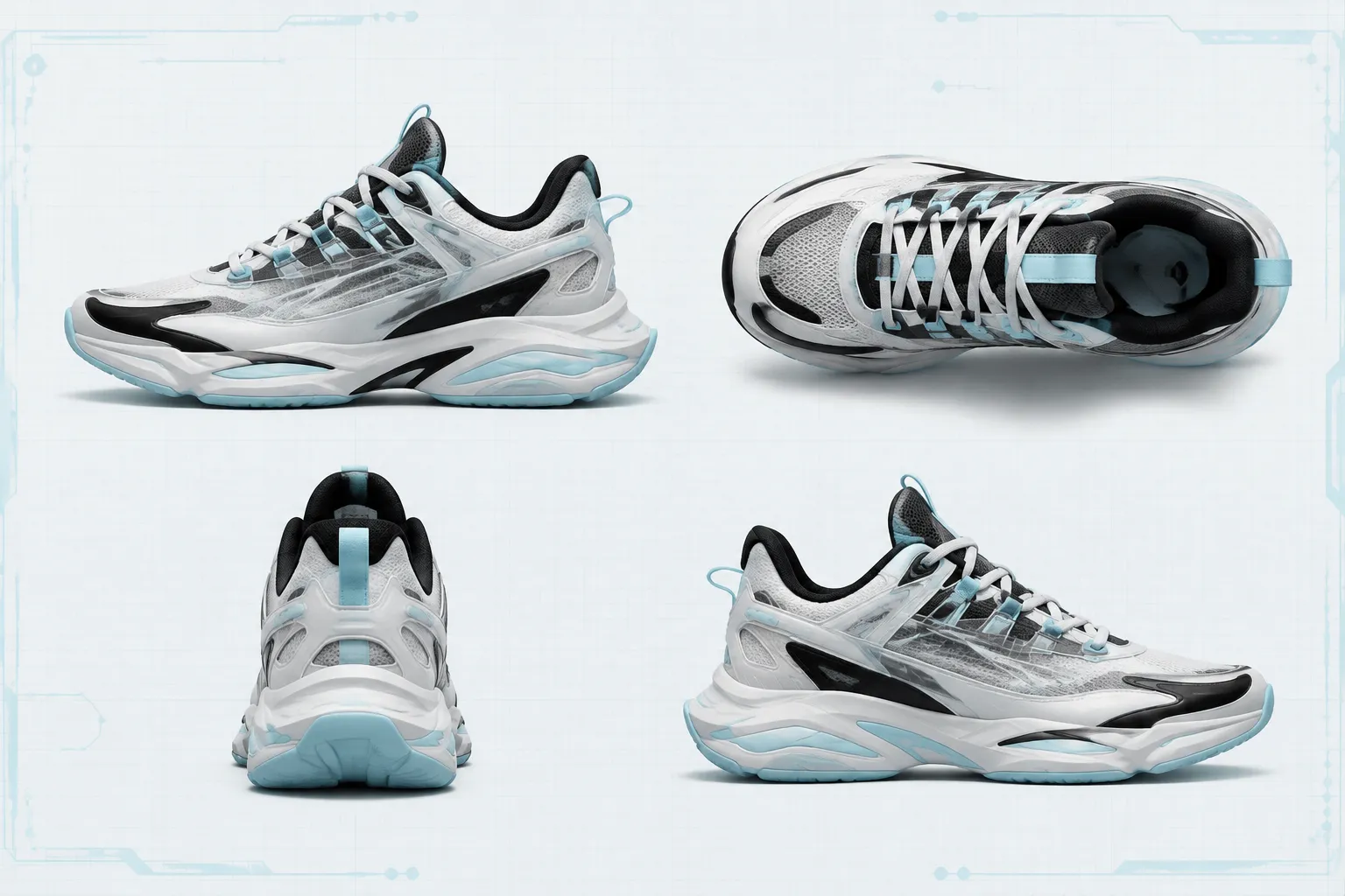
A single side view hides too much. Top, rear, medial, and detail views change the visible proportion of every zone.
The side view makes lateral blocking and sole relationships visible. The top view exposes the tongue, laces, eyestay, collar opening, and forefoot balance. A rear view reveals whether heel accents connect, split, or dominate. The medial view may expose asymmetrical zoning with no lateral equivalent.
Every required decision needs adequate view coverage.
Use the same core views for each variant when possible. Comparable framing reduces the chance of confusing a camera difference with a design difference.
- Are corresponding zones visible in each variant?
- Do repeated views use comparable orientation and crop?
- Does the same color assignment continue around the form?
- Do medial and lateral treatments differ intentionally?
- Does the top view preserve the expected dominant, supporting, and accent balance?
- Are rear graphics and heel zones shown clearly?
- Do close-ups clarify material cues without contradicting wider views?
- Are important decisions hidden by pose, shadow, or framing?
Missing coverage should be recorded as unresolved, not interpreted as approval. If the render set never shows the medial side, the reviewer cannot confirm medial colorway consistency.
Compare Materials Through Their Visible Cues
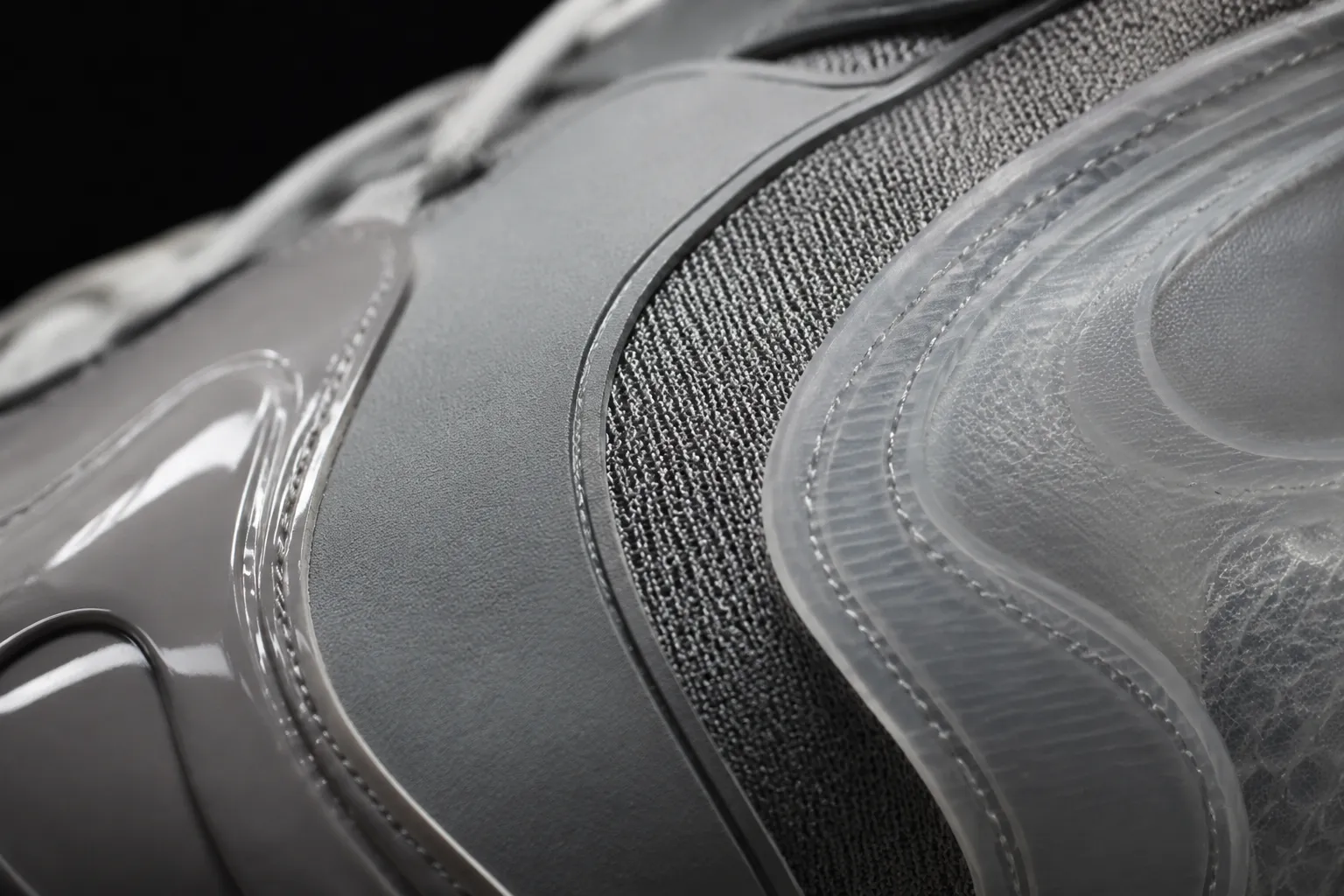
A color value does not appear independently of surface treatment. Gloss, roughness, weave, translucency, lighting, and surrounding colors can change how a rendered area is perceived.
A sneaker material study comparison should therefore review color and material cue together. Two panels may share an assigned digital color while appearing different because one is represented as smooth and reflective and the other as textured and diffuse.
That difference may be intentional. The relevant question is whether it supports the brief.
Matching inputs do not ensure matching appearances.
Record the visible cue rather than assuming a physical material outcome:
- The quarter appears lighter under the current lighting.
- The glossy overlay carries stronger highlights than the base.
- The mesh-like zone appears less saturated in the detail view.
- The translucent concept exposes an underlying color relationship.
- The rear panel changes appearance between the still render and turntable.
These observations are appropriate for render-based colorway review. Claims about substrate response, dye behavior, colorfastness, batch repeatability, or long-term appearance require physical standards, samples, and suitable evaluation.
Separate Difference Detection From Acceptance
A reviewer can notice a difference without deciding that it conflicts with the concept brief.
Color research distinguishes between perceiving a difference and accepting that difference for a defined use. That distinction is useful here, but it does not supply a universal sneaker tolerance.
During concept review, record both the observation and its disposition:
- Difference detected: the images do not look the same in a stated area.
- Difference accepted: the variation supports the intended hierarchy or fits the visual direction agreed for this review stage.
- Decision deferred: the difference may come from rendering, display, output, or material assumptions and needs another form of evidence.
This prevents a visible mismatch from becoming an automatic failure. It also prevents subjective screen acceptance from being recorded as a measurable physical tolerance.
Preference evidence has a similar limit. Research involving image-based sports-shoe color preferences can help explain why viewers respond differently, but preference is not a substitute for checking whether the concept follows its documented variant logic.
Use a Sneaker Variant Color Comparison Matrix
Side-by-side comparison is most useful when every row answers the same question. Avoid review boards where each variant uses different views, backgrounds, crops, or lighting unless those differences are themselves under review.
| Review variable | Stable collection rule | Allowed variation | Current finding |
|---|---|---|---|
| Upper zoning | Corresponding panels keep the same role | Hue and tone may change | Quarter role shifts in Variant C |
| Color proportion | Accent remains visually limited | Small area adjustment | Top view makes the accent dominant |
| Contrast | Heel remains the focal zone | Contrast strength may vary | Variant B redirects focus forward |
| Material cue | Base stays quieter than overlays | Texture may vary | Gloss makes the base compete |
| View coverage | Side, top, rear, and medial views are shown | Detail count may vary | Medial view is missing |
| Presentation | Neutral comparison conditions are available | Campaign framing may vary later | Background alters edge visibility |
Describe observable deltas. “Variant C feels wrong” is difficult to act on. “Variant C assigns the collection accent to the quarter and tongue, making it dominant in top and side views” identifies both the change and its consequence.
Review Collection Coherence at Two Distances
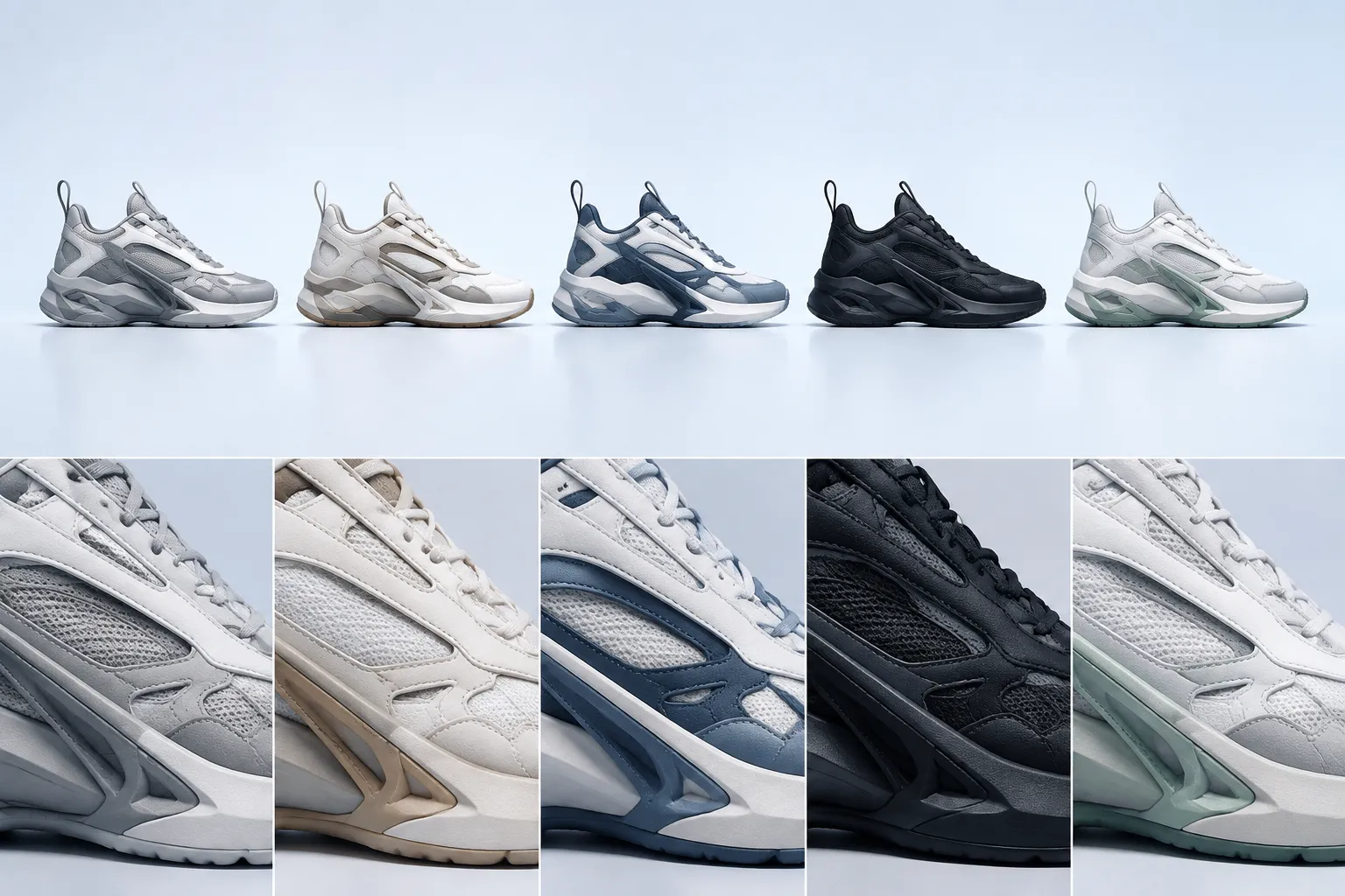
Collection coherence should be checked as both a lineup and a set of individual products.
From a distance, review the overall rhythm:
- Does one variant carry much more bright or dark area than the others?
- Does the strongest contrast recur in a consistent region?
- Are sole treatments related?
- Does one concept disappear against the shared presentation background?
- Does any variant appear to belong to a different blocking system?
Up close, inspect the transitions:
- Do overlays keep their intended roles?
- Are trim colors applied consistently?
- Do small accents repeat without spreading into unrelated zones?
- Do material cues support the same hierarchy?
- Are graphics and branding treated as part of the color relationship?
Lineup coherence can conceal local conflicts.
A collection may look balanced in a thumbnail lineup while containing contradictory panel assignments in detail views. The reverse is also possible: each shoe may appear internally coherent, yet the lineup lacks a shared rule. Both scales need a separate disposition.
Deliverables Change the Review Criteria
The underlying colorway logic should remain traceable, but each deliverable reveals different problems.
Comparison Views
A comparison view should minimize presentation differences. Comparable angles, scale, lighting, and backgrounds help reviewers isolate changes in zoning, proportion, contrast, and material cue.
This is the strongest deliverable for direct sneaker variant color comparison. It is not evidence of physical color matching.
Material Studies
A material study should make surface-response assumptions visible. It can compare matte, glossy, woven, translucent, or layered visual directions without claiming that the depicted behavior will transfer to a selected material.
The study is useful when the team must decide whether a material cue supports or disrupts the color hierarchy.
Campaign Mockups
Campaign mockup color consistency includes the interaction between the sneaker, environment, lighting, and post-processing. A warm scene treatment may shift visible relationships, while a dark background may obscure sole or upper edges.
Preserve a neutral comparison set alongside campaign imagery. Otherwise, reviewers may approve presentation effects without seeing whether the underlying variants remain coherent.
Non-Final Turntables
A non-final turntable colorway review shows how zones connect around the form. It can expose abrupt transitions, hidden asymmetry, lighting discontinuities, or moments when a dominant color expands as the shoe rotates.
Inspect representative frames as well as motion. A smooth clip can move too quickly for reliable zone comparison, while isolated frames may miss flicker or changing surface response.
Record Sources and Transformations
Every review set needs a source record. That record is separate from visual approval and does not itself establish permission for every intended use.
Record what is known:
- Reference filename and version
- Creator or provider
- Source location within the project
- Stated license or permission status
- Intended use recorded for the asset
- Color space, when known
- Conversion or export history, when known
- Display, proof, or output conditions, when known
- Changes made to the reference
- Open questions requiring confirmation
Screenshots, extracted colors, photographs, named swatches, and converted numeric values should not be treated as interchangeable evidence. If the chain is uncertain, keep that uncertainty visible in the handoff.
Do not duplicate an unverified reference merely to make every variant board look complete. A repeated asset can create the impression that its status and color interpretation have already been settled.
A Practical Review Sequence
Begin with the collection rule, not individual preference.
- State the invariant: define what must remain stable, such as zoning, hierarchy, accent location, or sole relationship.
- State permitted variation: name which hues, tones, contrasts, materials, or graphic treatments may change.
- Normalize the comparison: use comparable views, scale, crop, lighting, and background.
- Map upper zones: confirm that corresponding areas carry intentional roles across variants.
- Compare visible proportions: check dominant, supporting, accent, separator, and neutral relationships.
- Trace contrast: identify where attention moves in each view.
- Review material cues: note where surface response changes the apparent hierarchy.
- Check view coverage: record hidden or missing areas as unresolved.
- Test collection scale: review both the lineup and individual details.
- Inspect downstream deliverables: compare neutral views with campaign mockups and turntables.
- Update the source record: preserve known origins, transformations, and usage information.
- Separate decisions: record concept approvals, requested revisions, and sample-stage questions in different fields.
This sequence supports reviewing sneaker colorway consistency without converting visual agreement into unsupported physical conclusions.
Common Review Mix-Ups
Repeated Palette Versus Repeated Logic
The same palette can produce inconsistent variants when panel allocation changes. Different palettes can remain coherent when zoning and hierarchy stay intentional.
Rendering Difference Versus Design Difference
A lighter panel may reflect a changed color assignment, a material cue, a light source, exposure, or post-processing. The image alone may not identify the cause.
Visible Difference Versus Failed Brief
Detection is an observation. Acceptance depends on the stated purpose and review criteria.
Concept Approval Versus Product Approval
Concept approval confirms a visual direction within the reviewed deliverables. Physical color, construction, fit, comfort, durability, manufacturing behavior, and performance remain unresolved until appropriate samples or tests exist.
Source Record Versus Usage Permission
A source record documents what is known. It does not resolve missing permission, ambiguous ownership, or undocumented reuse conditions.
Questions Before Material Sampling
The final concept-stage footwear color review should make unresolved questions easy to hand off:
- Which rendered color relationships must become physical reference targets?
- Which zones require physical material comparisons?
- Which apparent differences may come from surface assumptions?
- Which views remain incomplete or contradictory?
- Which accents require closer control because they carry the collection identity?
- Which color transitions cross proposed material boundaries?
- Which references lack complete source or usage records?
- Which campaign treatments depart from the neutral comparison views?
- Which decisions belong to design review, and which require sampling or testing?
A clear handoff does not pretend these questions are answered. It identifies why each question exists and what evidence is needed next.
Final Review Standard
A concept-stage collection is visually consistent when its variants express a documented logic across upper zoning, color proportion, contrast, material cue, and required views. The colors may change substantially while those relationships remain coherent.
Approve only what the deliverables show. Record missing views, ambiguous surface responses, uncertain source history, and physical color questions as unresolved rather than filling the gaps with assumptions.
The practical disposition is narrow: approve the concept imagery for its stated visual purpose, revise the named mismatch, or move the unresolved question to design, engineering, sampling, or wear testing.
Sources
- Acceptability-based Brand Color Tolerance, A Case Study supports the distinction between noticing a color difference and accepting it for a defined use.
- European practices and philosophy in industrial colour-difference evaluation provides context for treating perceptibility and evaluation criteria as separate questions rather than universal visual rules.
- Engineered textile colour standards supports the boundary between a screen-based color direction and later physical reference or material evaluation.
- Prediction of Optimized Color Design for Sports Shoes Using an Artificial Neural Network and Genetic Algorithm is included as adjacent sports-shoe color research and does not establish a complete method for footwear render consistency review.