
Turntable Sequence QA
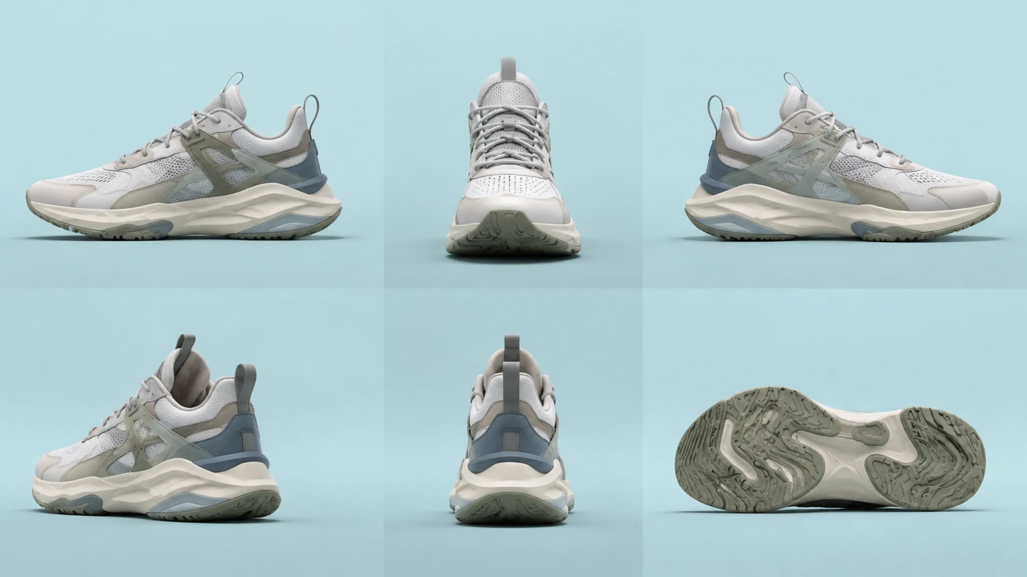
A shoe turntable render earns its place in review when each view answers a named question. The sequence should make the silhouette readable, separate upper zones, reveal surface response, and keep colorway or variant differences comparable.
Use it for visual direction and concept-stage decisions. A render can clarify construction intent while leaving fit, comfort, durability, physical performance, manufacturability, color comparison, and asset permissions for the appropriate downstream review.
Start With The Decision
Name the decision before judging the animation. A team reviewing silhouette balance needs different coverage from one comparing material appearance, color relationships, or a campaign framing direction.
- Visible decision: What should the reviewer decide from the sequence?
- Comparison set: Which alternative, colorway, upper treatment, or variant is being compared?
- Review stage: Is the asset for visual direction, design review, engineering handoff, sampling, or campaign planning?
- Unresolved questions: Which conclusions need a technical file, physical sample, calibration step, test, or permission record?
“Compare the sidewall proportion and heel structure across two upper directions” gives the sequence a usable job. “Make the shoe look premium” does not identify the visible change under review.
If the decision cannot be stated in one sentence, the turntable may be carrying several review jobs at once. Separate the deliverables or label the competing priorities before the team starts comparing frames.
What The Sequence Should Make Visible
A useful review separates form, surface, color, and presentation. Those variables interact, but they should not be allowed to obscure one another.
Silhouette Read
Inspect the relationship between toe volume, vamp rise, collar height, heel counter, outsole edge, and overall length as the shoe rotates. The side view usually carries the clearest proportion signal; three-quarter views add depth, while front and rear views expose width, symmetry, and visual weight.
- Does the toe shape remain consistent between side and three-quarter views?
- Does the collar appear to change because of perspective, or because the geometry changes?
- Does the heel counter stay aligned with the outsole?
- Does the outsole make the upper appear taller, flatter, heavier, or narrower?
- Does the same concept remain legible from every required angle?
These observations describe the rendered relationship between parts. They do not establish how the shoe fits, feels, behaves under load, or performs during use.
Upper Zoning
Upper zoning concerns the visible arrangement of panels, overlays, underlays, openings, graphics, and support-looking structures. The rotation should let reviewers follow those boundaries without guessing where a material or component begins.
A dark overlay on a dark base may create a unified read while allowing small construction changes to recede. A contrasting overlay can clarify the panel map, but it may fragment the silhouette or give one variant more visual weight than intended.
Compare panel size and spacing, overlay direction, toe and quarter transitions, tongue and heel treatment, seam or edge logic, graphic placement, and the relationship between upper zones and outsole geometry. The useful question is not which treatment wins by taste. Ask which contrast makes the current decision easier to inspect.
Surface Response
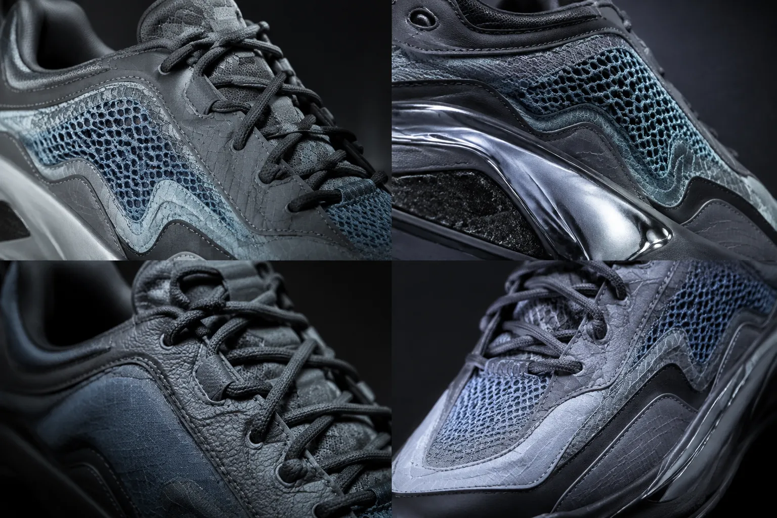
Material appearance changes with view direction, lighting, reflections, and geometry. Watch the moving sequence rather than relying on one attractive still.
- Does a glossy zone produce a controlled highlight or a distracting flare?
- Does a textured area retain visible relief as the shoe turns?
- Do adjacent surfaces separate through tone, reflection, texture, or edge treatment?
- Does the surface response support the intended material cue?
- Does the highlight travel continuously, or jump between frames?
“The render suggests a coated, reflective surface” is an interpretation of the image. “The shoe uses a durable coated material” requires material documentation or physical evidence. Technical work on view-dependent material visualization can help explain why a surface changes across angles, but it does not replace project-specific material records.
Compare Directions By Observable Deltas
A shoe turntable render review becomes more useful when alternatives are compared by change, not by general preference.
Quiet Upper Separation
One direction may use close tones and similar surface response across neighboring zones. The silhouette carries more of the design identity because panel boundaries recede.
This treatment can make the shoe read as a unified form. It can also obscure overlays, underlays, small construction changes, or the distinction between adjacent materials.
Assertive Upper Separation
A second direction may increase contrast between panels, introduce a different surface response, or place a stronger color relationship around the toe, quarter, or heel.
Construction intent becomes easier to inspect, but the silhouette may feel more segmented. The colorway may also appear heavier than the brief intended.
| Review variable | Direction A | Direction B | Decision status |
|---|---|---|---|
| Silhouette read | Lower contrast and a more unified mass | Stronger panel separation | Choose the required read |
| Upper zoning | Some boundaries recede | Boundaries remain easier to trace | Record the visible preference |
| Surface response | Restrained highlights | More active reflections | Check the intended material cue |
| Color relationship | Close tonal family | Clearer contrast | Confirm collection logic |
| Handoff need | Visual direction only | Visual direction plus material notes | Name the next owner |
The record should describe what the render communicates. It should not turn a visual preference into a conclusion about product behavior or production suitability.
Review Color Relationships Across Views
Colorway review is not only a check that each still image contains the intended colors. Compare the relationship between colors as the shoe rotates.
- Does the outsole change the perceived upper color?
- Does a reflective surface become lighter or darker at different angles?
- Does a logo remain distinguishable against its background?
- Do small accents stay visible from the views that matter?
- Does contrast make one variant appear to have a different silhouette?
A colorway can look balanced from the side and disconnected from the rear. A bright accent may clarify a feature from one angle while becoming the dominant shape from another.
Review the color direction in its intended output context. Display settings, print workflows, lighting, and image conversion can affect perception. A screen comparison supports a visual direction within the reviewed setup; it does not establish identical appearance across every display, medium, or physical material.
Check View Coverage Before Detail
A smooth sequence can still omit the view needed for approval. Coverage should follow the decision, not a fixed count of angles.
For Silhouette Review
- Clean side view
- Front and rear three-quarter views
- Direct front and rear views
- Outsole or bottom view when the sole profile matters
For Upper Zoning Review
- Side view with panel boundaries visible
- Toe and vamp views
- Quarter view
- Collar and heel views
- Close comparison frames for small graphics or overlays
For Material Appearance Review
- Angles where highlights travel across the surface
- Views showing adjacent material transitions
- A controlled neutral view for comparison
- Close frames that reveal texture or relief
- Repeated angles across colorways
A missing view matters when it hides the feature under review. Mark it as a coverage gap rather than filling it with inference. A documented footwear image workflow can provide useful viewpoint examples, but its coverage is not a universal rule for every turntable brief.
Evaluate Sequence And Camera Continuity
Continuity has two parts: the shoe's apparent state and the camera's apparent state. The object should rotate without unexplained changes in geometry, texture placement, scale, lighting, or color, while the camera should keep a consistent relationship to the shoe unless a move is intentional.
- Jumps in toe or heel proportion
- Drifting shoe position within the frame
- Changes in crop or scale
- Sudden background movement
- Shifting shadow direction or light intensity
- Texture swimming or sliding
- Logos or graphics changing position
- Highlights popping between frames
- Undocumented variant-specific changes
Distinguish deliberate emphasis from accidental drift. A close-up may suit a material study, but it should be labeled clearly when the main sequence is intended to compare silhouette proportions.
Smooth motion is not enough. A sequence can interpolate cleanly between mismatched states, so pause at matched angles and inspect the design cues beneath the motion.
Use Framing As A Comparison Tool
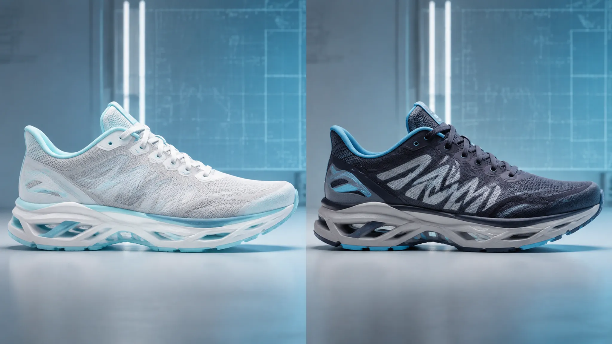
Framing controls what the viewer compares first. A centered shoe on a neutral background may support silhouette inspection, while a lower angle can make the outsole or heel appear more prominent.
- Shoe scale within the frame
- Toe and heel clearance
- Left and right margins
- Consistent vertical position
- Background contrast and shadow placement
- Crop behavior during rotation
- Enough image area for the required detail
Use matched framing for variant comparisons wherever possible. A larger crop can make one variant appear more substantial even when the geometry has not changed.
A campaign mockup and a review turntable serve different jobs. Mood, dramatic lighting, and a strong focal crop may support communication, while a review asset needs enough consistency for the stated design comparison.
Inspect Variant Consistency
Variant logic is easy to lose when several shoes share a base model. A colorway change should remain distinguishable from a geometry change, and a material study should not quietly alter panel proportions.
For each variant, record:
- Base model identifier
- Changed upper zones
- Changed sole or heel features
- Color and material assignments
- Graphic or logo changes
- Camera and lighting status
- Unresolved differences
- Source and rights status for imported assets
Review matched views side by side. When the side view uses a different crop from the rear view, framing differences can be mistaken for product differences. Consistency helps isolate the actual visual decision; it does not establish that every variant is ready for manufacture.
Match The Review Path To The Deliverable
The same footwear turntable should not be judged by one universal checklist. Its acceptance criteria change with the handoff stage.
Concept Direction
Ask whether the visible direction is understandable. Focus on silhouette read, upper zoning, color relationships, major material cues, differences between alternatives, and unresolved decisions.
Design Review
Ask whether the visual structure is coherent enough for the next design decision. Inspect panel relationships, feature visibility, graphics placement, variant logic, surface response, and any additional views needed.
Handoff Review
Ask whether the asset carries enough information for the receiving workflow. Check file version, application history, geometry or animation transfer, material and texture references, camera information, metadata, naming consistency, and missing elements after export or import.
Research on apparel and footwear interoperability describes possible problems when data moves across applications, including differences in rigs, poses, metadata, and transferred content. Treat those as conditional workflow risks, then inspect the actual project files.
Sampling Or Physical Validation Handoff
The question changes outside the render. Route questions about fit, physical material behavior, wear, construction, manufacturing, color comparison, or product use to design, engineering, sampling, manufacturing review, calibration, or testing.
A visual asset can carry construction intent, but the receiving stage must own the questions the image cannot answer. Record that owner and the next review point.
Keep Source And Rights Records With The Render
A polished image can conceal uncertainty about its ingredients. Keep a source record for each imported or generated visual asset.
- Original source and creator or supplier, when known
- File or model version
- Permission or license status
- Permitted use and restrictions
- Third-party textures, graphics, logos, scans, or reference images
- Processing history and project revision
- Export date
- Unresolved ownership questions
Do not label an asset official, authorized, or cleared unless the project records support that status. A visible brand mark, borrowed texture, scanned component, or reference image may need a separate permissions review.
Rights documentation is a workflow record, not a visual property. The render cannot establish ownership or permission by itself.
Common Review Confusions
A Smooth Turntable Is Not Always Consistent
Motion quality can distract from geometry drift, changing crops, or unstable highlights. Pause at matched angles and compare the underlying cues.
A Realistic Surface Is Not A Confirmed Material
Highlights and texture may suggest a gloss, mesh, leather-like grain, rubber-like softness, or coated finish. They do not establish composition, hand feel, wear behavior, or manufacturing response.
More Angles Do Not Always Mean Better Coverage
Additional views help only when they expose a relevant decision. Repeated angles with the same obstruction can add duration without adding useful evidence.
A Campaign Frame Is Not Automatically A Review Frame
Mood, contrast, and dramatic lighting may support communication while reducing comparability. Label campaign mockups separately from non-final review turntables.
A Single-Screen Color Match Is Not Universal Accuracy
Perception can change across devices, media, and lighting conditions. Keep color conclusions tied to the reviewed setup or documented color workflow.
A Clean Render Is Not Product Approval
The image may support concept discussion while physical questions remain open for design, engineering, sampling, manufacturing review, and testing.
A Generated Image Is Not A Complete Design Record
Image-generation workflows can alter small details, logos, color, or geometry. When a concept moves into a 3D handoff, inspect and document the geometry instead of treating the image as a full specification.
A Compact Shoe Turntable Render Review
- State the decision: Name the silhouette, upper, material, colorway, variant, framing, or handoff question.
- Confirm the stage: Separate concept direction from design, engineering, sampling, manufacturing, calibration, and testing.
- Check matched views: Confirm the required angles, crop, scale, and shoe position remain comparable.
- Read the silhouette: Inspect toe, vamp, collar, heel, outsole, and overall mass across the rotation.
- Trace upper zoning: Confirm that panels, overlays, openings, graphics, and transitions remain visible.
- Watch surface response: Look for highlight continuity, material separation, texture behavior, and unexplained changes.
- Compare color relationships: Check contrast, accent visibility, outsole interaction, and apparent silhouette changes.
- Review continuity: Look for geometry, camera, lighting, background, texture, and framing drift.
- Record source status: Attach model, texture, graphic, scan, and permission information where known.
- Name the next handoff: Mark what is decided, what remains unresolved, and which stage must address it.
The output should be a decision record rather than a simple pass-or-fail label.
A Useful Review Record
Keep the visible observation separate from the pending validation.
- Decision
- Which visual direction or variant is being reviewed?
- Visible support
- What does the render show clearly?
- Comparison delta
- What changed between the alternatives?
- Coverage gap
- Which view, detail, or sequence condition remains unclear?
- Source status
- What is known about the model, texture, graphic, scan, or reference asset?
- Unresolved boundary
- What cannot be concluded from the render?
- Next handoff
- Does the question move to design, engineering, sampling, manufacturing review, calibration, testing, or permissions?
FAQ
What is a shoe turntable render review?
It is a structured inspection of a rotating footwear concept render for visible silhouette, upper zoning, surface response, color relationships, view coverage, framing, continuity, and variant consistency.
How many views should a footwear turntable include?
There is no universal count. Required coverage depends on the decision: silhouette review may need side, front, rear, and three-quarter views, while material review may need angles that expose highlights and transitions.
Can a render confirm how a shoe will fit?
No. It can show intended external form and construction direction. Fit remains an open question until the appropriate last, sample, fitting process, and physical review are available.
Can surface highlights confirm the physical material?
No. Highlights and reflections describe the rendered appearance under the chosen setup. They may support a material direction, but they do not establish composition, hand feel, wear behavior, or manufacturing response.
How should different shoe colorways be compared?
Use matched camera, framing, lighting, view coverage, and scale. Then compare color separation, accent visibility, outsole interaction, and whether contrast changes the apparent silhouette.
What causes a turntable sequence to feel inconsistent?
Common visible signals include changing crop, drifting camera position, texture movement, unstable highlights, frame-to-frame geometry changes, altered lighting, or undocumented variant differences. Inspect paused matched angles instead of judging motion alone.
Is a campaign mockup suitable for design QA?
It can support mood or communication, but it may not provide reliable comparison. Campaign lighting, perspective, cropping, and composition can obscure the variables a review turntable needs to show.
What belongs in a concept-stage handoff?
Include the intended decision, matched views, model and variant identifiers, material and color notes, camera or framing information, processing history, source records, known permission status, and unresolved questions. Name the receiving stage as well.
Close The Review With A Disposition
Approve the image for its stated visual job: silhouette, upper zoning, surface response, color relationships, view coverage, framing, continuity, or variant logic. Record what remains obscured, assign unresolved questions to the appropriate downstream stage, and keep source and permission records with the asset.
The final note should state what the render communicates, what the comparison revealed, what the team decided, and what happens next.