
Camera, Lighting, and Presentation References
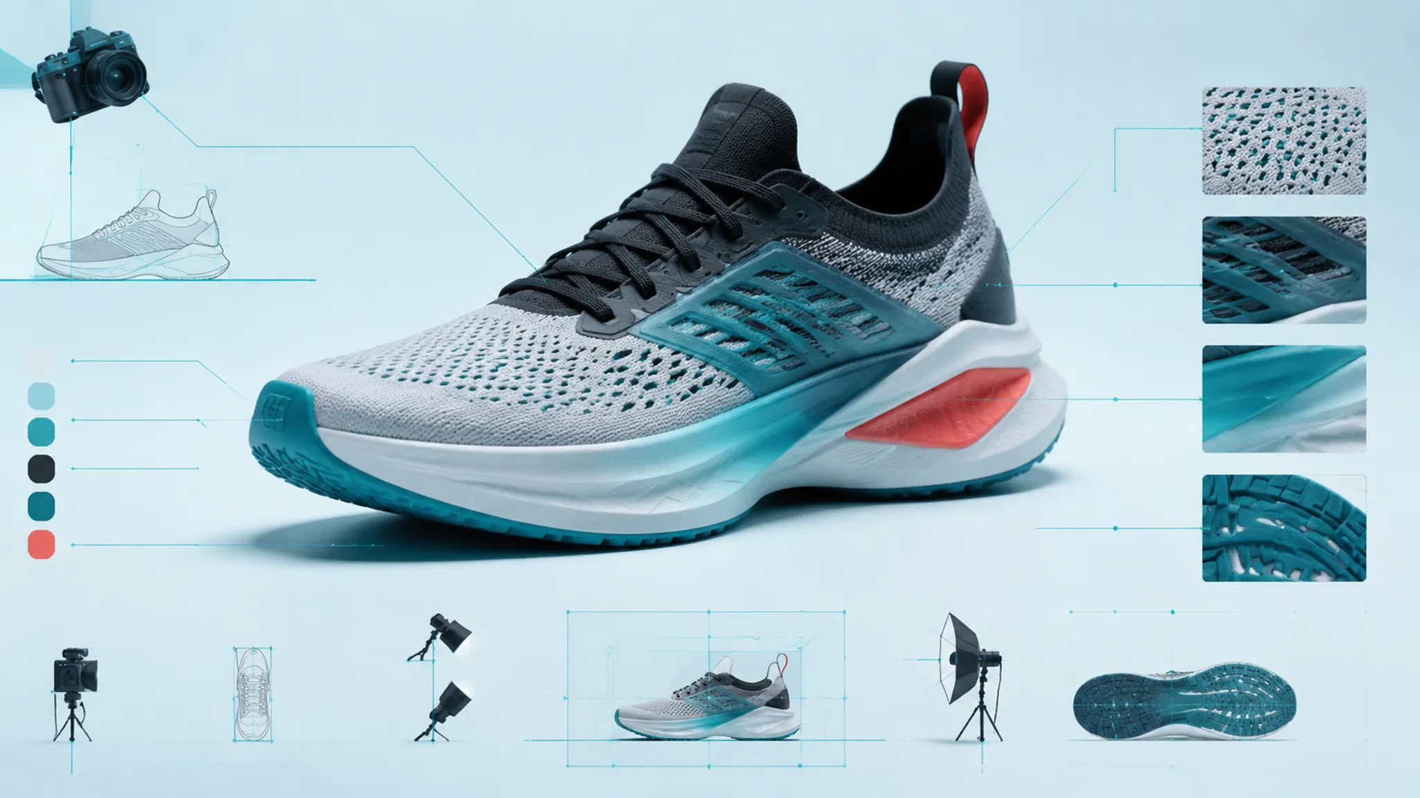
Start with the decision the image must support. A footwear render used to inspect silhouette needs different view coverage from one used to compare upper zoning, surface response, color relationships, or campaign mood.
Put that purpose at the top of the sheet. Then record camera, projection, lighting, framing, source status, output use, and unresolved dependencies as separate fields. The result is a product rendering reference that turns “use a clean angle with premium lighting” into choices a reviewer can inspect.
Define the Review Purpose First
Complete one sentence before collecting images: “This view is for reviewing…” The answer might be silhouette read, upper zoning, outsole visibility, material cues, color relationships, variant consistency, or campaign presentation.
Silhouette review needs restrained views
Toe spring, heel profile, collar line, sole proportion, and overall stance should remain legible. Dramatic perspective may add energy while enlarging or compressing the forms under discussion.
Upper review needs visible zone boundaries
The selected views should separate the vamp, eyestay, quarter, heel, collar, tongue, and overlays where those areas exist. Lighting needs enough edge definition to prevent neighboring zones from merging into one dark or reflective mass.
Material and color review needs controlled conditions
A material study should expose represented highlights, reflections, texture scale, and shadow transitions. A colorway comparison should hold camera, light, background, framing, and output treatment steady enough for color relationships to remain the main visible change.
Presentation review serves another job
A campaign mockup may use stronger perspective, deeper shadows, environmental reflections, or cropped framing. Those choices can carry a visual story, but they may obscure construction intent and should not replace controlled comparison views.
Name one primary purpose and, where necessary, one secondary purpose. Asking one image to resolve every design and presentation question usually makes each decision harder to evaluate.
Separate Camera Position, Object Rotation, and Projection
Similar-looking angles can come from different scene changes. Moving the camera changes the viewing position; rotating the object changes which surfaces face a camera that may otherwise remain fixed.
Record these variables independently:
- Camera side, height, distance, and angle
- Object rotation, tilt, and support position
- Perspective or orthographic projection
- Focal length or field of view, when known
- Sensor or virtual-sensor context
- Crop, framing margins, and output aspect ratio
If one concept appears longer or more aggressive, the visible difference may come from geometry, perspective, pose, or framing. Research on render-and-compare estimation supports this uncertainty: focal length and object pose can be difficult to infer uniquely from appearance alone.
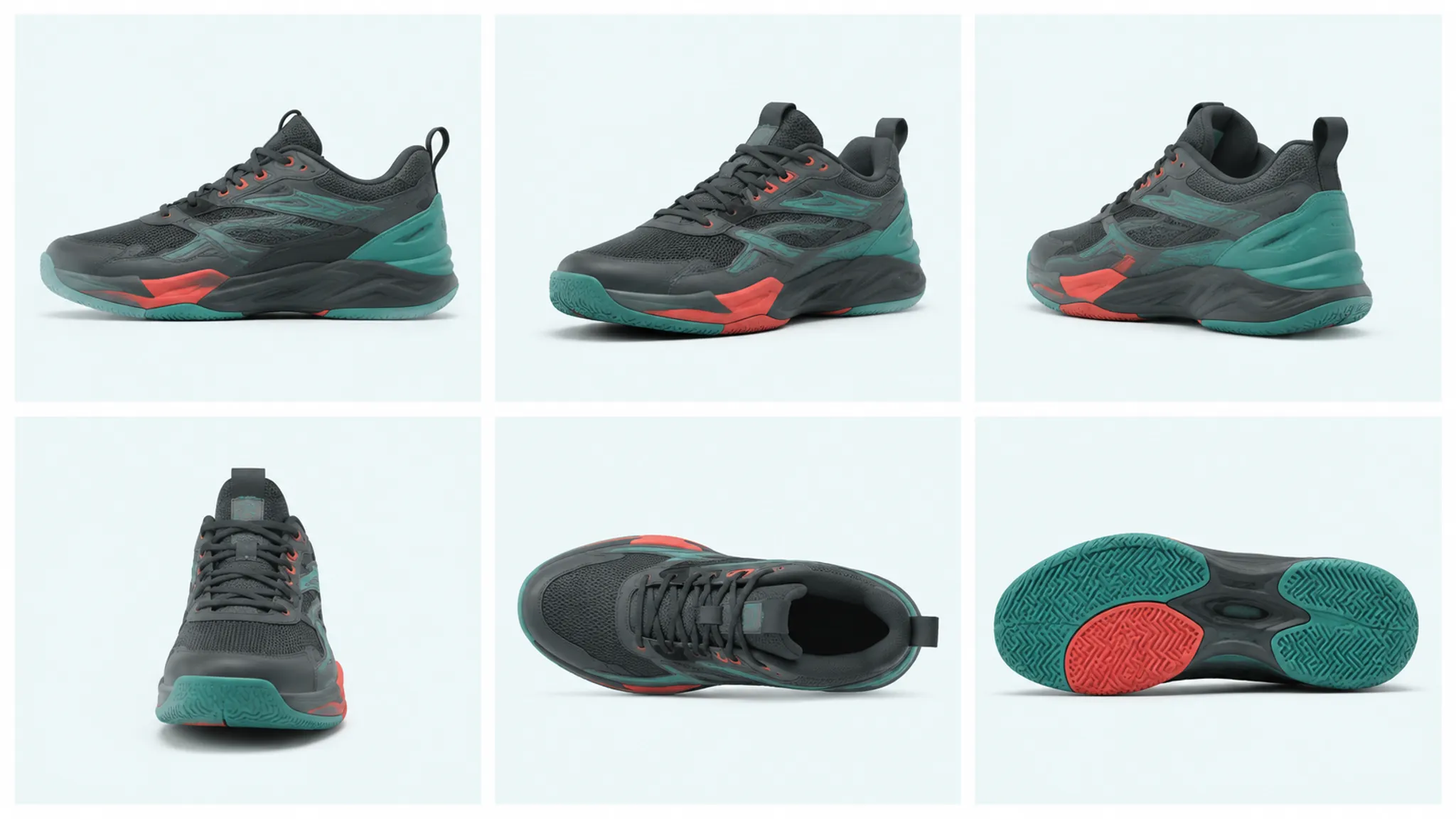
Choose views by what they reveal
| View | Useful for | Common limitation |
|---|---|---|
| Lateral or medial side | Silhouette, sole profile, upper zoning | Width, depth, and the opposite side remain hidden |
| Toe three-quarter | Toe volume, lace path, layering, sidewall depth | The forefoot may receive extra perspective emphasis |
| Heel three-quarter | Heel structure, collar, rear transitions | Forefoot details become less legible |
| Front or rear | Width relationships, centering, symmetry | Length and side profile are compressed |
| Overhead | Throat, tongue, laces, opening, toe plan | Sole height and lower sidewall are obscured |
| Outsole | Tread zoning, coverage intent, graphics | Upper volume and physical behavior remain unresolved |
Annotate which side is shown. “Side view” is incomplete when medial and lateral geometry, graphics, or color placement differ.
Focal length needs context
A focal-length value alone is not a reproducible footwear render camera reference. Field of view also depends on sensor or virtual-sensor settings, while camera distance, pose, crop, and framing shape the result.
Avoid treating one familiar lens value as a universal footwear setting. Pair available numbers with the visible consequence: “restrained perspective; toe and heel remain comparable in scale” is more useful than an isolated measurement.
Projection changes the comparison
Perspective represents depth through convergence and relative scale. Orthographic projection removes that convergence, which can help profile and zoning comparisons but may feel flatter than a presentation image.
Neither is preferable for every task. Use a locked projection for variant comparisons, a restrained side view for profile review, and purposeful perspective where volume or campaign composition is the stated decision. Mark unavailable projection data as unknown.
Annotate Lighting by Its Visible Effect
“Soft studio lighting” is too broad to reproduce or review. Describe direction, apparent softness, contrast, shadow behavior, reflection shape, and the surface cue the light is intended to expose.
- Frontal light can preserve readability while reducing shadow transitions.
- Side or raking light may separate texture and layered edges while obscuring the opposite side.
- Edge light can define the silhouette but may leave upper zoning unclear without sufficient fill.
- Top-biased light can expose the toe, eyestay, tongue, and collar while losing lower sidewall detail.
Describe the review consequence. “The lateral overlays remain distinct” identifies an observable result; “the shoe looks better” does not.
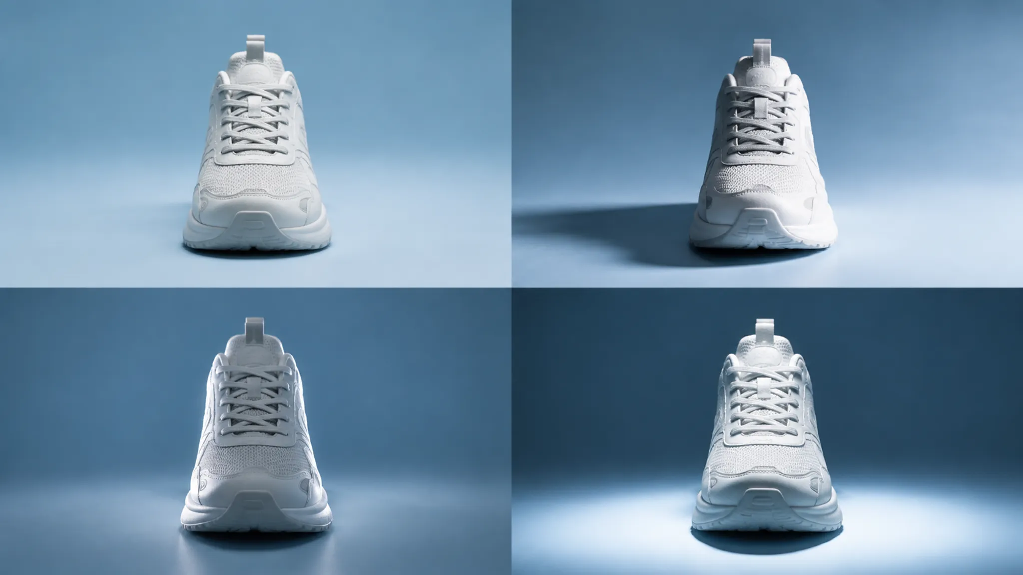
Softness changes edge and surface read
Broader represented sources generally create wider highlight transitions and softer shadow edges. Smaller or more directional sources can produce tighter highlights and harder transitions.
Broad highlights may clarify curved volumes, while narrow highlights may expose edge changes or reflective accents. Flat illumination can merge adjacent matte zones; deep shadows can hide stitching, perforation, and layered construction.
Shadows need a stated function
A contact shadow places the concept against a surface and makes its stance visible. A campaign image may instead use a long cast shadow as a graphic element.
Record whether the shadow grounds, describes depth, or carries the composition. Conflicting shadow and reflection directions can make the represented surface response difficult to interpret.
Read Material and Color as Represented Cues
The image may suggest a material direction through texture, roughness, highlights, reflections, and shadow transitions. These cues can separate mesh-like, coated, molded-looking, woven-looking, or reflective zones without establishing an exact physical material.
Research on digital fabric representation indicates that folds, motion, shape, and specular roughness influence perceived sheen and material categorization. Inspect the represented settings together with the lighting and view that expose them.
- Record the intended cue and visible texture scale.
- Compare highlight width, reflection clarity, and roughness between adjacent zones.
- Note geometry or normal detail carrying the effect.
- Mark the underlying material specification as known, provisional, or unknown.
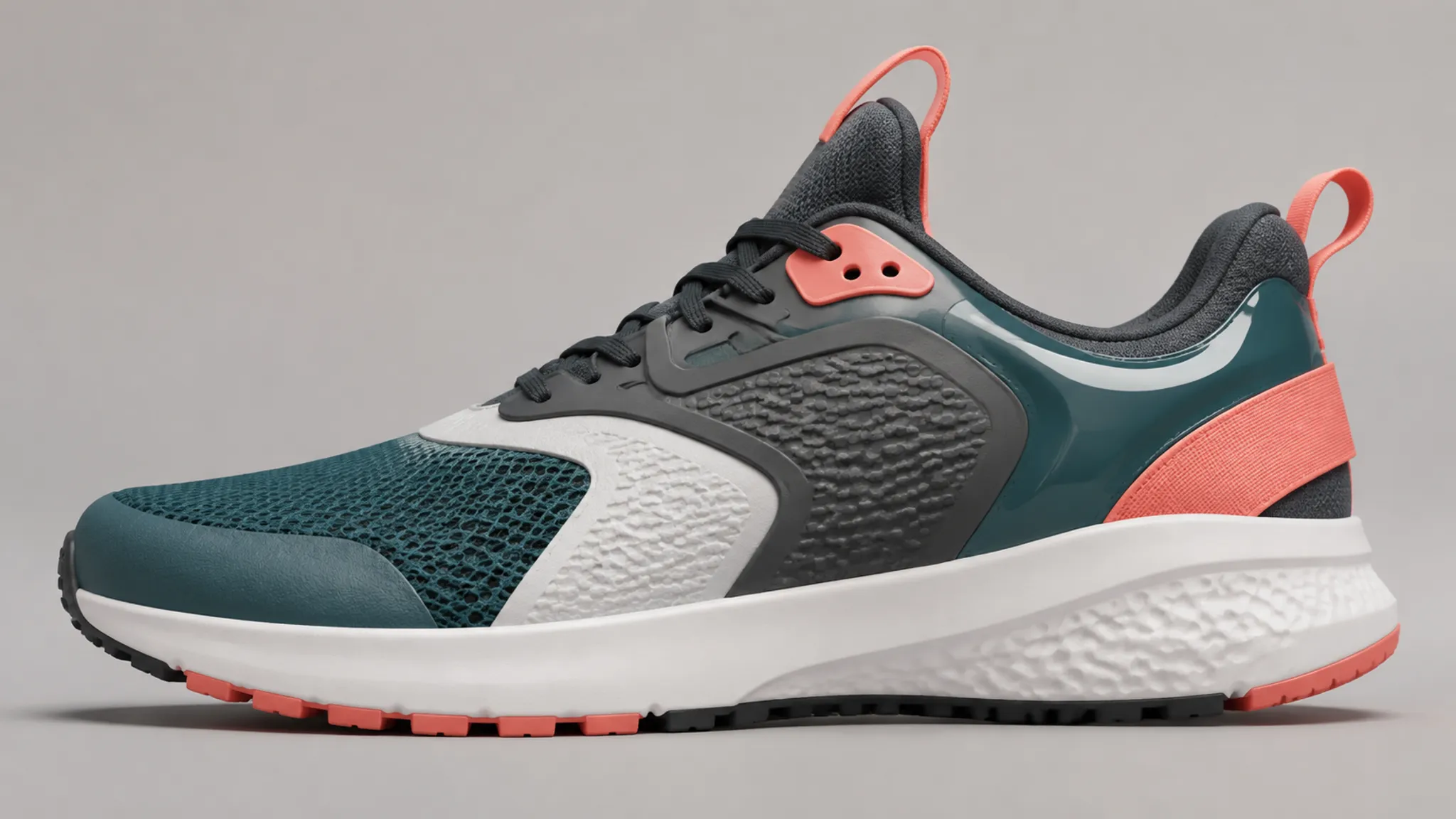
Use language such as “the render suggests a low-roughness synthetic overlay.” Tactile behavior, finish tolerance, construction method, durability, fit, and manufacturing feasibility remain questions for specifications, samples, engineering, and appropriate physical evaluation.
Protect color relationships from scene drift
Light color, exposure, background, reflections, display conditions, and post-processing can all change visible color relationships. Product-photography workflow research places color management across capture, editing, conversion, print, and web output.
For the reference sheet, record approved color references, scene lighting, background, tone treatment, output color space when known, and intended digital or print use. Where color is the decision, place a controlled comparison beside the styled presentation.
Match the Reference to the Deliverable
Internal concept review
Prioritize visibility over atmosphere. Include enough coverage to inspect silhouette, upper zoning, sole relationships, material cues, and unresolved geometry.
E-commerce-like comparisons
Consistency is the visible decision. Lock camera, object placement, projection, lighting, background, crop, margins, and output dimensions across variants.
A repeated scene helps reviewers attribute differences to the represented product. It does not establish how a future physical item will appear across devices or uncontrolled lighting.
Campaign presentation
Stronger perspective, deliberate occlusion, directional shadows, and environmental reflections may support the image direction. Replace vague adjectives with observable instructions such as “low camera with controlled toe emphasis” or “edge highlight separating the collar.”
Approve the image for its stated job. A campaign mockup can settle composition and lighting mood without carrying silhouette, material, or color approval by itself.
Collection and variant comparison
State which variables remain fixed and which carry the collection story. Label geometry changes, color-placement changes, and scene changes separately so reviewers do not confuse presentation variation with product variation.
Use Repeated-Subject Comparisons to Diagnose Mismatches
When an output diverges from its reference, compare the same footwear subject while changing one documented variable at a time where practical. This can separate camera position from object rotation, perspective from geometry, lighting from material settings, and exposure from colorway changes.
Label the actual delta: “camera raised; object rotation unchanged” carries more information than “cleaner option.” Where several variables must change together for a campaign treatment, show that combined direction apart from the diagnostic comparison.
A non-final turntable can reveal transitions missed by still views. Keep the object center, rotation path, projection, lighting, background, and timing stable when comparison is the purpose.
Keep Source Status Attached to Every Image
Visual approval and source review are separate decisions. Public availability does not establish permission, license scope, endorsement, or authorization for reuse.
Preserve the original creator, source location, collection date, documented permission or license basis, intended use, modification status, and any credit requirements. Mark unresolved questions instead of assigning a status from appearance or platform placement.
Discovery boards may separate images from their creators and original context. Trace each selected reference to its source before it enters a deliverable, and carry that record through review and handoff.
Build the Annotated Reference Sheet
Use one row per image or one annotation panel beside each thumbnail. Parallel fields make comparison easier and expose missing information.
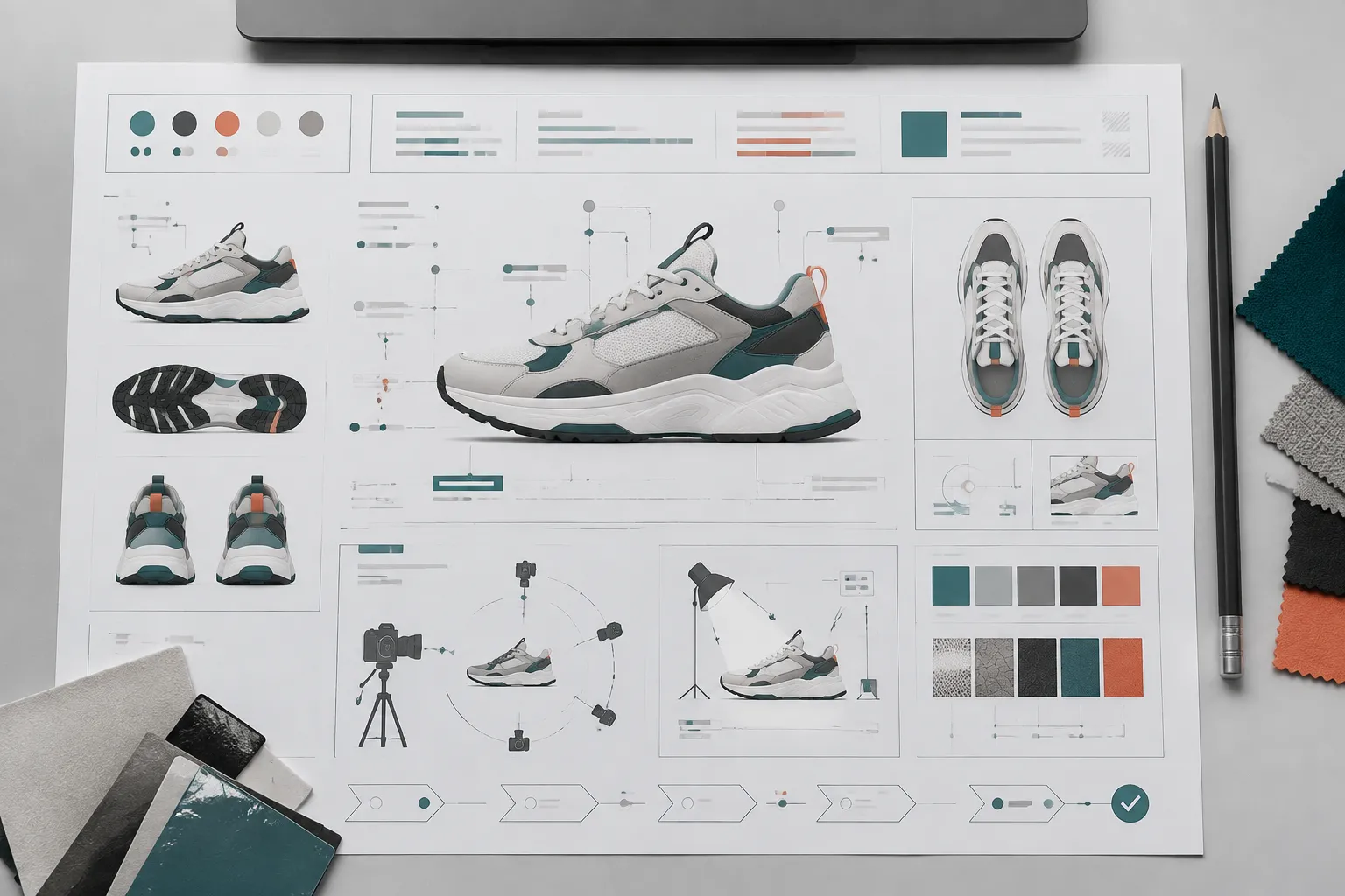
| Field group | Record |
|---|---|
| Identity | Reference ID, purpose, side or feature, source record, permission status, modification status |
| Camera | Position, height, distance, object rotation, projection, focal length or field of view, crop, aspect ratio |
| Lighting | Key direction, softness, fill, edge separation, shadows, background, reflections, lost detail |
| Product read | Silhouette, upper zoning, outsole visibility, material cue, color relationship, ambiguities |
| Handoff | Output use, dimensions, locked variables, allowed changes, supported decisions, unresolved work |
Mark unavailable information as unknown. A blank field can be mistaken for approval, irrelevance, or an accidental omission.
Review the Sheet Before Handoff
- Every image has a stated review purpose.
- Camera position, object rotation, projection, crop, and framing are separated.
- View coverage exposes the decisions that other views obscure.
- Lighting notes describe visible effects rather than taste.
- Material descriptions remain represented cues, not physical conclusions.
- Controlled comparisons are separated from campaign treatments.
- Each changed variable is labeled across repeated subjects.
- Every external image carries a source and modification record.
- Provisional geometry, material inputs, and permission questions remain visible.
- Physical-product questions move to design, engineering, sampling, or appropriate testing.
The sheet is complete when the visible decision is clear, the responsible variables are recorded, and unresolved work no longer hides inside phrases such as “better angle,” “more realistic,” or “stronger lighting.” Approve the documented visual purpose, request missing views or records, and route physical or source questions to the appropriate handoff.
Sources
- Focal Length and Object Pose Estimation via Render and Compare
- Reference Assets: Leveraging Traditional Photographic Techniques to Improve 3D Object Renditions
- Digital fabrics for online shopping and fashion design
- Product Photography for an Online Store and a Printed Catalog
- 3D Modelling For Photographers: What You Need to Know