
Color, Material, and Finish Reference Sets
A footwear mood board becomes useful when each reference answers a visible review question.
Is the decision about palette, upper zoning, material cue, or surface response under light? When those questions are mixed together, a team can approve an atmosphere without deciding what the concept carries forward. Separate the variables first, then compare the directions they create.

A practical reference set distinguishes three connected cues:
- Color: hue, lightness, saturation, contrast, and relationships between footwear zones.
- Material: the intended surface or construction cue, such as leather-like, suede-like, textile, rubber-like, metallic, or translucent.
- Finish: the visible response created by texture, grain, polish, matte behavior, patina, or reflectivity.
The set does not need to predict the finished product. It needs to make the current visual decision inspectable and leave later physical questions clearly marked.
What a Footwear Mood Board Needs to Show
Start with the decision, then collect only references that help answer it.
A color-led board may need palette swatches, comparison views, upper-zone mapping, and limited context imagery. A material-led board benefits from close surface references, physical swatches when available, seam or panel cues, and notes showing where each direction appears on the shoe. A finish-led set needs views that make gloss, texture, reflectivity, or surface variation visible at the intended scale.
The same image can serve different purposes, but its role should be labeled. A campaign mockup may suggest an emotional direction; it should not be treated as evidence of material composition. A close-up may show grain or nap; it does not establish the substance beneath that surface.
A reviewable set usually records:
- The decision supported by the reference.
- The footwear zone or component involved.
- The visible cue being carried forward.
- The source creator or publisher, when known.
- The source location and collection date.
- The license or permission status, when known.
- The intended use of the reference.
- The question that remains unresolved.
Keeping this record beside the visual decision prevents an attractive image from quietly becoming an undocumented specification.
Separate Color Relationships from Material Cues
Color answers a relationship question, not only a naming question.
“Luxury black” might mean a near-black upper with charcoal contrast, a warmer black beside polished hardware, or a tonal arrangement that separates the outsole and branding. “Warm neutral” might point to beige, cream, muted brown, or off-white relationships rather than one exact color chip.
Translate the phrase into visible decisions:
- Which zone carries the darkest value?
- Where does contrast separate the panels?
- Does the accent support the logo, a feature, or a seam line?
- Is the palette tonal, complementary, restrained, or deliberately high contrast?
- Does the relationship hold across lateral, medial, top, and three-quarter views?
- Which areas should recede, and which should attract attention?
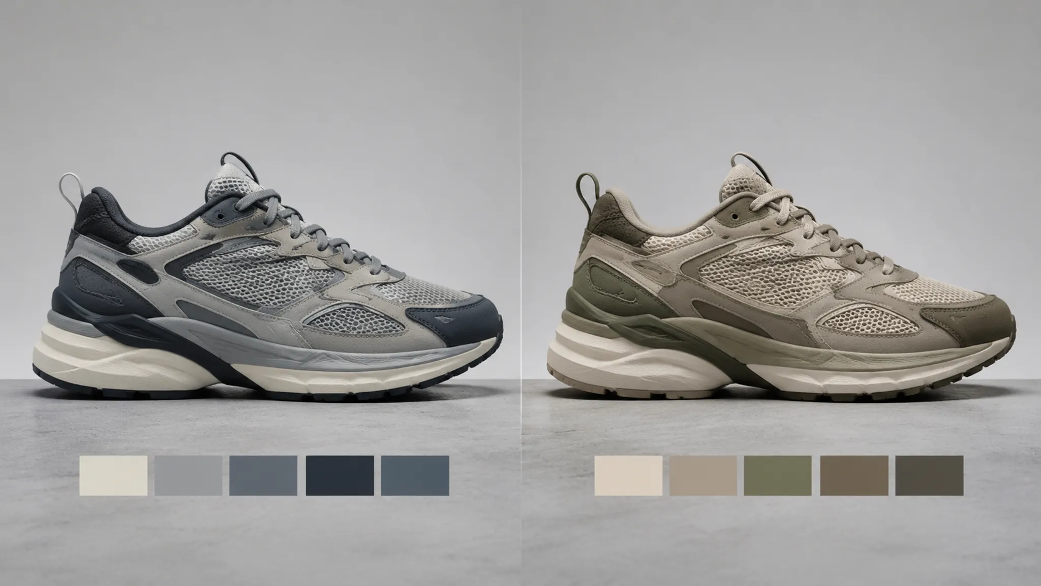
A hypothetical black-and-neutral direction could combine black, charcoal, warm beige, off-white, and a restrained silver accent. That is a concept example, not a universal formula. Its usefulness depends on upper zoning, camera view, material response, and review purpose.
Color blocking may make the silhouette easier to parse by separating panels and components. It may also obscure the form when adjacent zones have similar values or when a high-contrast accent pulls attention away from the intended feature. The side view makes these relationships visible, but it cannot establish how colors will reproduce on a particular substrate.
Use Color Extraction as a Discussion Starting Point
Extracted palettes can identify recurring hues, lightness relationships, and contrast patterns across a group of images. They can also expose inconsistency: two references labeled “warm neutral” may carry different undertones or values.
The result remains dependent on the image, lighting, display, substrate, and finish represented. A screen color is not automatically a controlled production color, and a digital swatch does not establish how a pigment, coating, textile, or molded part will appear.
Useful labels include:
- “Approximate warm beige from reference image.”
- “Dark value intended for outsole separation.”
- “Silver cue appears reflective in this lighting.”
- “Exact color specification pending controlled reproduction.”
Map the Upper Before Choosing More References
Upper zoning determines where a color or material cue actually works.
Map visible regions such as the toe box, vamp, eyestay, quarter, tongue, collar, heel counter, side branding, mudguard, and overlays. Labels vary with the construction under review, but the principle holds: each reference should identify the area it influences.
A zone map can compare two directions without ranking them by taste:
| Review variable | Direction A | Direction B |
|---|---|---|
| Main upper | One dominant tone | Two related tones |
| Overlay contrast | Low contrast | Strong panel separation |
| Branding | Integrated into the upper | Visible accent |
| Outsole relationship | Tonal continuation | Dark grounding element |
| Finish emphasis | Broad surface response | Localized detail response |
The useful difference is not that one direction is better. One may keep the silhouette quiet, while the other makes panel architecture more visible. The board should show that consequence clearly.
Consistent blocking can help a collection or variant group feel related. Changing hue, lightness, or accent placement can create distinct options while preserving the same zone logic. If the upper zones change as well, color and structure move together, making the comparison harder to interpret.
For a controlled comparison:
- Hold the view angle constant when comparing colorways.
- Hold the zone map constant when comparing palette options.
- Hold the color relationship constant when comparing surface cues.
- Label any deliberate change in silhouette, paneling, or camera framing.
- Separate a new concept from a new variant of an existing concept.
A non-final turntable adds view coverage, but it should not replace a clear comparison view. Motion may reveal that a finish disappears outside one angle, while a still image may make a small accent appear more dominant across the form.
Material References Need Their Own Evidence Layer
Material describes the surface or construction direction the concept is suggesting.
Terms such as leather-like, suede-like, textile, rubber-like, metallic, pebbled, napped, or translucent help a team discuss appearance. They do not identify composition, processing, supplier, or physical properties on their own.
A material reference should distinguish three things:
- Visible surface cue: grain, nap, weave, smoothness, translucency, or apparent density.
- Intended location: toe, quarter, collar, tongue, overlay, lining, or sole-related component.
- Confidence level: visual reference, supplier reference, documented material, or unresolved direction.
A close image of a napped surface may support a soft-looking or brushed visual direction. It does not prove a particular fiber, hide, coating, or construction. A leather-like appearance does not establish leather, and a synthetic-looking surface does not establish a specific polymer.
Material appearance can also shift the way color and contrast are perceived. The same nominal color may read differently across a smooth surface, a textured surface, a reflective coating, or a visibly napped surface. Place the color and material references near each other, but keep their labels separate.
Physical swatches can reveal texture and reflectance relationships that screens obscure. They still require supplier confirmation, engineering review, sampling, controlled reproduction, and appropriate testing before downstream physical decisions are made.
Finish Studies Show Surface Response
Finish describes how the surface appears to respond to light and texture.
A finish study may compare:
- Gloss and matte response.
- Smooth and textured appearance.
- Even color and visible variation.
- Clean surface and distressed or patinated cues.
- Low reflectivity and metallic or high-reflectivity response.
- Uniform treatment and localized edge or panel treatment.
“Polished” should become a visible observation: a concentrated highlight, smoother apparent surface, darker edge response, or stronger reflection. “Tactile” should point to grain, nap, relief, weave, or layered texture. “Distressed” should identify the location and pattern of variation instead of functioning as a general mood label.
A glossy black may show sharper highlights than a matte black, while a textured neutral may appear lighter or less uniform at the same nominal color. These are useful visual directions for review, not proof of a specific treatment or measured behavior.
Keep finish studies close enough to the footwear form that the team can judge scale and placement. An abstract surface photograph may show a useful texture, but it cannot show whether that texture belongs on a toe box, a flexible-looking panel, a logo application, or a small overlay.

Compare Reference Set Types by Decision
A Directional Mood Board
A directional board answers: “What visual territory should the concept explore?”
It may combine footwear imagery, color relationships, material cues, surface studies, context images, and short labels. It suits a stage where the silhouette or upper zoning remains open, but its limitation is specificity. It is not automatically a material selection, supplier brief, or technical specification.
A Footwear CMF Reference Set
A footwear CMF reference set answers: “How should color, material, and finish decisions relate across the shoe?”
It separates palette swatches, upper-zone mapping, material references, and finish studies. Each item carries a role, location, and source record. The comparison becomes more useful when the footwear view stays consistent and the exact change between variants is named.
Its job is to organize visual decisions. Physical outcomes remain open.
A Colorway Comparison View
A colorway comparison answers: “Which palette relationships should move into the next review?”
Keep the silhouette, camera, and upper zoning stable. Change the palette relationship, accent location, or value structure one variable at a time where possible. The render shows whether a colorway separates panels, carries a visual story, or shifts attention toward a feature; it does not establish demand, production color, or physical performance.
A Material or Finish Study
A material or finish study answers: “Which surface cue needs closer examination?”
Use close references, annotated zones, finish alternatives, and physical samples when available. Identify whether each reference is a visual analogy or a documented material direction. The question remains open until the relevant material, process, scale, and reproduction conditions are confirmed.
Keep Source Rights Beside the Visual Decision
Source documentation is part of review quality.
For every external image, record the creator, source location, collection date, license or permission status, and intended use when available. Keep the record attached to the reference so reviewers can connect the visual decision with its source context.
WIPO: Copyright supports the practice of recording source information, but a general copyright resource cannot clear a particular image or establish permission for every use.
A simple status field can distinguish:
- Permission documented.
- License terms located; intended use still needs checking.
- Source identified; rights status unresolved.
- Internal or commissioned asset.
- Reference retained for private discussion only.
Source notes improve traceability; they do not change the rights status. The same discipline applies to generated or edited references: note the original source, transformation, tool or process when relevant, and intended use.
Common Confusions During Review
“The Render Shows the Material”
It shows an intended material appearance. Grain, gloss, nap, or reflectivity may be visible, while composition and physical properties remain unresolved.
“The Extracted Palette Is the Production Palette”
It is a discussion starting point. Reproduction depends on the material, finish, lighting, display, and specification process.
“The Board Is the Materials Package”
A mood board communicates direction. A materials package requires more specific documentation and downstream confirmation.
“A Glossy Cue Identifies the Finish Process”
It identifies a visible surface response. The actual treatment needs appropriate technical documentation.
“Approval Means the Shoe Is Ready”
Concept approval addresses visible direction. Questions about fit, comfort, durability, performance, manufacturing, and consistency belong to later design, engineering, sampling, reproduction, or testing stages.
These distinctions keep each review responsible for the question it can answer.
A Practical Review Sequence
State the decision in one sentence: palette relationship, upper zoning, material cue, finish response, variant logic, or handoff requirement.
Then inspect the set in this order:
- Silhouette read: Does the color and material arrangement clarify or obscure the footwear form?
- Upper zoning: Are the affected panels and components named?
- Color relationship: Are hue, value, saturation, contrast, and accent placement visible?
- Material cue: Is the reference describing appearance, documented composition, or both?
- Finish response: Does the view show texture, gloss, matte behavior, patina, or reflectivity?
- View coverage: Does the direction remain legible beyond one attractive angle?
- Variant logic: What stays fixed, and what changes between options?
- Source record: Are creator, source, date, and rights status recorded?
- Handoff status: What must be confirmed by design, supplier, engineering, sampling, reproduction, or testing?
Close with two separate lists.
Decided Now
- Color relationship.
- Upper-zone emphasis.
- Material or finish direction.
- Required comparison views.
- References retained for the next review.
Still Unresolved
- Exact material composition.
- Supplier availability or specification.
- Physical color reproduction.
- Construction and engineering implications.
- Fit, comfort, durability, and performance questions.
- Manufacturing and testing questions.
- Permission for intended external use.
That split gives the next team a usable handoff without turning visual approval into a physical product claim.
FAQ: Footwear Color, Material, and Finish Reference Sets
What is a footwear CMF reference set?
It is a structured visual set that separates color direction, material cues, and finish response while showing how those variables apply to footwear zones. It supports concept review; it is not automatically a technical specification.
How should a footwear mood board separate color, material, and finish?
Use distinct labels beside the decision each reference supports. Color describes relationships and zoning, material describes the intended surface or construction cue, and finish describes how that surface appears to respond to light and texture.
Can an image-extracted color be used for footwear?
It can organize comparison options or start a palette discussion. Treat the exact specification as pending until the relevant material, finish, lighting, display, and reproduction conditions are addressed.
Do physical swatches resolve the uncertainty?
They expose texture and reflectance more directly than many screens. Supplier confirmation, engineering, sampling, controlled reproduction, and appropriate testing may still be needed.
Does a leather-like reference prove the material is leather?
No. Visual resemblance does not establish composition. Record it as a surface direction unless material identity is documented separately.
What should be recorded for mood board image rights?
Record the creator, source location, collection date, license or permission status, and intended use when known. A source record improves traceability but does not itself establish permission.
When is the reference set ready for handoff?
It is ready for the next concept review when the visible decision, zone mapping, variant differences, source status, and unresolved questions are clear. Later handoffs need evidence appropriate to design, engineering, supplier confirmation, sampling, reproduction, or testing.
Sources
- WIPO: Copyright
- A Study on Perception of Visual–Tactile and Color–Texture Features of Footwear Leather for Symmetric Shoes
- Research on the value of CMF design in industrial products
- Design Methodology and Technology of Textile Footwear
- A Methodology for Matching Colors in Product Design Using Gradient Colors and a New Aesthetic Measurement Method