
Lighting and Material-Read Review
A footwear concept render can look polished while leaving the central review question unresolved: what, exactly, is the viewer being asked to approve?
Lighting changes the answer. A broad, soft source may clarify the silhouette while flattening surface differences; a directional source may separate an overlay or suggest a glossy finish while making the form feel harsher than intended. The useful question is not whether the image looks realistic in general, but which visible decision the lighting supports, which decision it obscures, and what still needs a sample or downstream review.
Use footwear render lighting as a concept-stage review condition, not as proof of physical product behavior.
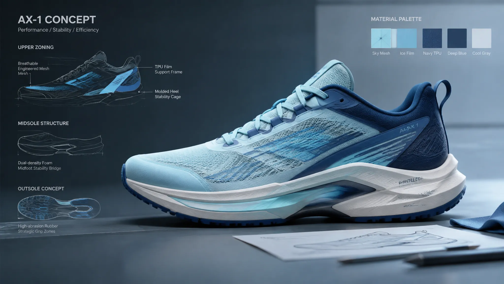
More specific pages
These pages continue the topic in smaller, more specific directions.
Start With The Visible Decision
Name the unresolved decision before changing the light.
“Make it more premium” is not a usable lighting brief. It may refer to a cleaner silhouette read, stronger upper zoning, quieter color relationships, clearer material separation, or a more controlled campaign mood. Each interpretation calls for a different comparison.
Translate the request into an observable target:
- Silhouette read: the toe, instep, heel, collar, and sole profile remain legible at the intended viewing size.
- Upper zoning: overlays, panels, openings, lacing areas, and construction boundaries separate without artificial outlining.
- Material cue: the render suggests differences such as matte, smooth, textured, coated, or reflective surfaces.
- Color relationship: adjacent colors remain distinguishable and retain the intended hierarchy.
- View coverage: the selected views expose the areas required for the current decision.
- Variant consistency: camera, scale, background, and lighting allow colorways or material options to be compared.
- Decision clarity: reviewers can state what is approved and what remains unresolved.
A useful review begins with one sentence: “This comparison is intended to decide whether the upper zoning reads clearly in side view.” The lighting can then be judged against that sentence.
How Lighting Affects Silhouette Read
Silhouette clarity starts at the outer contour.
A side view makes the relationship between toe shape, instep height, heel volume, collar line, and sole profile visible. If the background value sits too close to the shoe, the contour can recede even when the model itself is well defined. Strong internal contrast can create the opposite problem by drawing attention toward surface drama instead of the outline.
Broad Frontal Lighting
Broad frontal lighting can keep the whole shoe readable and reduce deep shadow across the upper. It suits an initial silhouette comparison when the team needs to inspect proportion, volume, and major part placement.
Its limitation is separation. Similar-value panels may merge, and shallow transitions can disappear. A render that reads clearly in frontal light may not provide enough information for detailed upper zoning.
Side-Biased Lighting
Side-biased lighting can make changes in curvature, panel breaks, and sole edges more visible. It is useful when the question concerns how the form turns through space.
The same direction can overstate a shallow crease or make a smooth surface appear more irregular. Treat the contrast as a visual aid, not as proof that the physical construction will show the same relief.
Top Or Rim Emphasis
Top or rim emphasis can separate the collar, tongue, heel-counter area, and upper edge from the background. It may also help a dark upper separate from a dark sole.
Used too strongly, it creates a bright outline that carries the silhouette independently of the actual form. The image then communicates a lighting effect rather than a neutral shape read.
The useful comparison is not “soft light versus dramatic light.” It is “which light makes the current shape decision more legible without introducing a misleading cue?”
Upper Zoning Needs Controlled Contrast
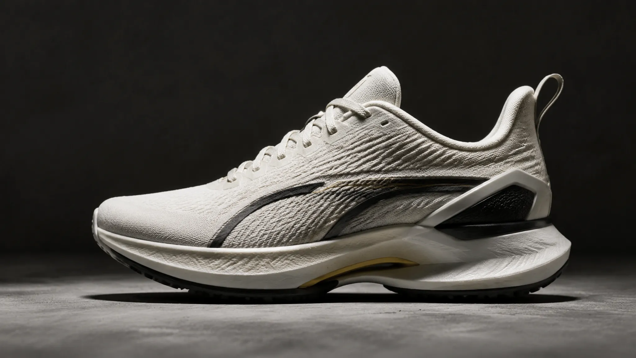
Upper zoning is read through boundaries, value changes, texture changes, and the way surfaces turn.
A panel may be geometrically present but visually absent when neighboring areas share similar color and surface response, or when the light falls evenly across both regions. Increasing contrast can make the zone visible, but excessive contrast may imply a stronger construction break than the concept actually contains.
Review the upper in layers:
- Primary zones: identify the main body, overlays, quarter, toe area, heel area, tongue, and collar.
- Secondary details: inspect laces, eye stays, perforation fields, printed graphics, and small reinforcement areas.
- Transitions: check whether boundaries are visible because of geometry, material difference, color difference, or lighting alone.
- Hierarchy: confirm that the intended focal area carries attention without making every seam compete equally.
- Coverage: use a close comparison view only when the detail itself is the decision.
A strong highlight may expose an overlay in one view and lose it in another. That is a review signal. The zone may need a clearer material or geometry definition, or the deliverable may need a view that carries the decision more reliably.
Material Cues In Concept Renders
Material read is a suggestion built from surface response.
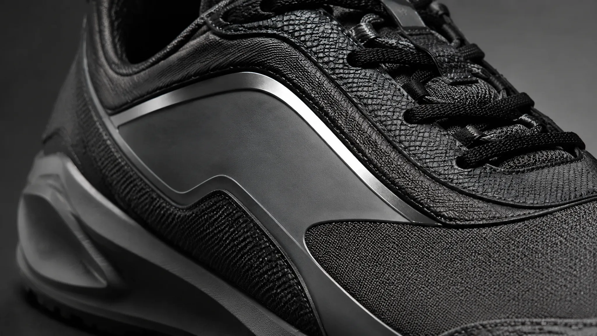
The viewer may infer a matte textile, smooth synthetic panel, coated area, reflective trim, or textured upper from the distribution of highlights and shading. These cues help teams compare material directions before physical sampling, but they do not establish the physical material, finish, construction, or wear behavior.
A useful material review asks three questions:
- What cue is visible? A broad highlight, narrow reflection, subdued gradient, visible grain, or sharp edge response.
- What interpretation does it support? The surface appears smoother, more textured, more reflective, or more visually distinct from its neighbor.
- What remains unresolved? Physical hand feel, color under different lighting, abrasion behavior, bonding, stitching, fit, and production outcomes require evidence beyond the render.
Lighting direction matters because surface cues do not appear equally in every condition. A broad, low-contrast environment may keep a matte area quiet and stable while reducing the distinction between related surfaces. A concentrated highlight can make a reflective area obvious, but it can also dominate the review and hide the underlying geometry.
Do not use the most expressive light for every material question. Establish the base read with a restrained comparison pass, then add a focused material study when surface response needs separate discussion.
Surface Response Can Clarify Or Distort
Surface response is connected to form. Highlights follow curvature, edges, and transitions, so the viewer may read lighting structure as construction information.
A highlight that travels cleanly across a panel can support the interpretation of a continuous surface. A break may suggest a change in plane, a seam, an overlay, or a different finish. These are useful observations, but they remain interpretations of the image.
Inspect uncertain areas under more than one controlled condition:
- If a boundary remains visible across two lighting directions, it carries more stable visual information.
- If it appears only under one sharp highlight, record it as lighting-dependent.
- If it disappears when the camera changes slightly, the current view may not provide enough coverage.
- If a textured material loses its cue under soft lighting, create a material study rather than forcing contrast into the main presentation.
- If the highlight overwhelms the panel color, separate the material-read review from the colorway review.
A render shows how the digital surface responds in that scene. It does not establish how a physical surface will respond across environments or after construction.
Research on geometry, illumination, and light-material interaction supports this narrower reading: appearance depends on the relationship between the object, its surface properties, the light, and the viewing condition. The evidence helps explain the mechanism; it does not turn a concept image into a product test.
Color Relationships In Footwear Renders
Color review is relational, not isolated.
A dark upper beside a light midsole can make the upper appear more compact or the sole more prominent. A saturated accent can pull attention away from a construction detail. A warm background can alter the perceived relationship between neutral panels even when the digital color values have not changed.
For each colorway, compare:
- the dominant upper color against the sole;
- the accent against surrounding panels;
- the collar, tongue, and lace area against the main body;
- the logo or graphic against its field;
- the background against the outer silhouette;
- the same material across different colorways.
Keep the camera, crop, scale, background, and lighting direction consistent when the decision concerns variant logic. Otherwise, a presentation change can be mistaken for a colorway change.
A separate mood pass may use a warmer or cooler atmosphere for campaign intent. Label that purpose clearly. A campaign mockup can communicate a story direction, while a neutral comparison view carries more useful information for deciding whether adjacent colors separate.
Color appearance remains conditional on the display and viewing environment. A concept render can support a color or material direction, but a physical color decision needs an appropriate color check and sample review. Research on leather and display lighting is useful context for this limitation because the observed color relationship can shift with viewing conditions.
Lighting Directions For Footwear Renders
There is no single lighting direction that answers every footwear review.
| Review question | Lighting priority | Main risk |
|---|---|---|
| Does the silhouette hold at a glance? | Even contour separation and controlled background contrast | Internal detail may flatten |
| Does the upper zoning read? | Moderate directional contrast across panel boundaries | Shadows may exaggerate construction |
| Does the surface appear matte or reflective? | A light structure that produces a readable surface response | Highlights may dominate the form |
| Do colorway relationships separate? | Consistent, restrained illumination across variants | Atmosphere may shift perceived color |
| Does the shoe work in a campaign mockup? | Lighting that supports the intended scene and hierarchy | Presentation mood may hide unresolved details |
| Does a non-final turntable remain coherent? | Stable lighting and exposure across views | A strong angle may not transfer as the camera moves |
Use two passes when the review contains competing needs. A neutral pass can carry proportion and color comparison; a material study can isolate surface response. One image should not be asked to settle silhouette, material identity, campaign mood, and physical behavior at the same time.
Render View Coverage Changes The Review
One view rarely carries every decision.
A side view is efficient for silhouette and upper zoning. A three-quarter view can show how overlays, toe volume, heel structure, and sole geometry relate in depth. A top-angled view may clarify the opening, tongue, lacing area, or forefoot layout. A rear view can expose heel balance and collar alignment.
Match the view set to the review stage:
- Early direction: use a primary side or three-quarter view to compare overall concepts.
- Upper review: add views that expose panel transitions and construction intent.
- Material comparison: keep the view stable and provide a detail crop where surface response is the decision.
- Colorway comparison: use matched framing across every variant.
- Campaign mockup: add the intended scene only after a product-focused view has carried the underlying decision.
- Non-final turntable: check whether the read remains coherent as the camera moves, without treating the animation as physical validation.
Multiple viewpoints can help present a shoe, but view coverage is not a universal count. Build it around the decision being reviewed.
Variant Consistency In Concept Renders
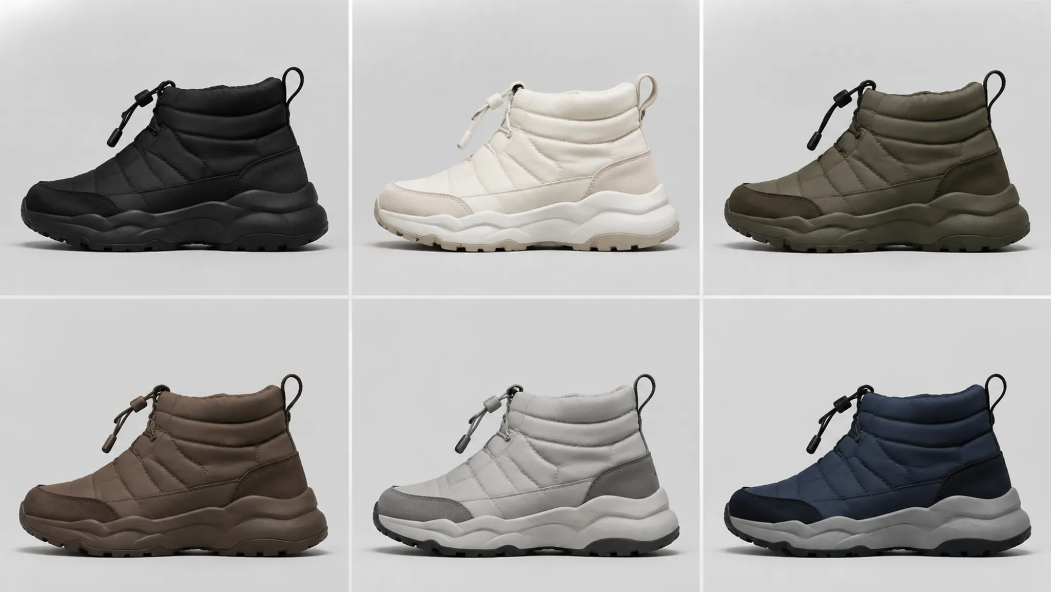
Variant logic fails when the presentation changes between options.
If one colorway receives a brighter key light, tighter crop, or lighter background, its stronger read may be attributed to the design rather than the setup. The same problem appears in material comparisons when a reflective panel looks more important simply because its highlight is better positioned.
Record the shared conditions:
- camera position and lens choice, where relevant;
- crop, scale, and orientation;
- background value and environment;
- lighting direction and intensity relationship;
- exposure and post-processing treatment;
- material assignment version;
- colorway name or internal identifier;
- intentional differences that should not be mistaken for setup drift.
Then isolate the variable under review. When comparing smooth and textured uppers, keep color and framing stable. When comparing two color relationships, avoid changing the surface treatment at the same time.
Consistency does not require every image to be identical. It requires the differences to be explainable.
A Practical Review Path
Use this sequence when feedback is broad or conflicting.
- State the decision. Write the approval question in visible terms: silhouette, zoning, material cue, color relationship, view coverage, or presentation mood.
- Establish a neutral comparison. Create a restrained concept render that lets reviewers inspect the shoe without a strong campaign effect.
- Compare one lighting change. Change one meaningful variable: direction, softness, background contrast, or reflected environment. Note what becomes clearer and what recedes.
- Check the intended view. Review the image at the size and crop used in the actual handoff. A detail that reads only when enlarged may not support the main decision.
- Test the variant set. Place the relevant colorways or material options under matched conditions. Record whether differences come from design or presentation.
- Mark the evidence boundary. Separate “the overlay reads more clearly” from questions that require physical evidence.
- Route the next handoff. Send silhouette and upper decisions to design review, construction questions to engineering, material and color questions to sampling or color review, and physical behavior questions to appropriate testing.
This keeps concept approval moving without turning a render into a substitute for later product work.
Common Review Mix-Ups
“The material looks accurate.”
Replace this with a narrower observation: “The render suggests a low-gloss surface under this lighting.” Physical material, finish, construction, and wear-related questions remain unresolved.
“The shoe feels too flat.”
Ask whether the issue is silhouette, shadow structure, upper zoning, or material response. A stronger light may increase depth while also changing the intended color relationship.
“The black version loses detail.”
Check background contrast, panel value separation, highlight placement, and crop before changing the colorway. Detail may be hidden by the review condition.
“The render proves the design works.”
A render can support concept comparison and construction intent. Fit, comfort, durability, safety, manufacturability, production readiness, and tested performance require later evidence.
“This image can be used everywhere.”
A campaign mockup, design review image, material study, and non-final turntable have different jobs. Reuse is useful only when the image still carries the decision accurately.
Source And Rights Records Belong In The Handoff
A visual review also needs a source record.
For each externally supplied image, texture, reference, or material study, record the origin and known rights status. Do not describe an asset as approved for a particular use unless documented permission or licensing supports that wording. A reference can guide color, surface, or mood without becoming part of the final deliverable.
Keep the record attached to the concept package:
- asset name and version;
- source location;
- creator or provider when known;
- permission or license information when available;
- intended use;
- modifications made;
- unresolved source questions.
The render itself cannot establish source status. That question belongs to documented source review.
From Concept Approval To Sample Handoff
Concept approval should close a visual question, not every product question.
A useful handoff states three things:
- Approved visually: for example, the side silhouette, upper zoning, or color relationship shown in the agreed comparison view.
- Still unresolved: for example, physical material behavior, construction method, fit, comfort, durability, color under other viewing conditions, or manufacturability.
- Next owner or stage: design refinement, construction review, engineering review, sampling, color check, or appropriate wear testing.
Physical prototyping is where digital materialization and visual intent meet construction decisions. A render may help the team decide what to prototype, but it does not replace the sample.
Wear testing belongs after the relevant physical version exists and the question concerns behavior in use. A convincing turntable or material study should not be treated as evidence for that stage.
Review Questions
What is the best lighting for a footwear render?
The appropriate lighting depends on the decision. Use controlled, even illumination for silhouette and variant comparison; use directional contrast when a surface or panel transition needs inspection. Judge the result against the review question rather than against style alone.
How do I make upper zoning clearer?
First identify whether the boundary is geometric, material-based, color-based, or lighting-dependent. Adjust one variable at a time, then confirm the zone in more than one relevant view.
Can a render establish material accuracy?
No. It can suggest a surface response and support a material direction at concept stage. Physical material, finish, construction, color behavior, and wear-related questions remain open until the relevant sample or review exists.
Should every colorway use the same lighting?
Matched lighting is preferable when comparing variants. A separate campaign or mood treatment can follow, provided it is labeled by purpose and does not replace the controlled comparison.
How many views should a footwear concept include?
Use the minimum view set that answers the current decision, then add coverage where the form or upper cannot be judged from the primary view. Side, three-quarter, top-angled, and rear views serve different inspection needs.
When is a concept render ready for handoff?
It is ready for the next review when the intended visual decision is legible, comparison conditions are recorded, unresolved questions are named, and the image is not presented as evidence of physical validation.
The Review Standard
A strong footwear render lighting review makes the visible decision easier to discuss.
It shows whether the silhouette holds, whether upper zoning separates, whether surface response supports the intended material cue, whether colors maintain their relationship, whether views cover the required areas, and whether variants can be compared under consistent conditions.
It also records the limit of the image. Concept approval can guide design, engineering, sampling, color review, and later testing; it cannot stand in for those stages. Approve the image for its stated job, revise the named visual elements, or move the unresolved question to the next appropriate handoff.
Sources
- Computational model for hyper-realistic image generation using uniform shaders in 3D environments - ScienceDirect
- Cognition of Color Shift in Leather Products and the Influence of Display Lighting of Luxury Goods
- The effect of geometry and illumination on appearance perception of different material categories
- Visual Quality Assessment of 3D Models: On the Influence of Light-Material Interaction
- Effects of light map orientation and shape on the visual perception of canonical materials
- The Realization of the Design and Processing of Ladies' Shoes Pictures on Web