
Footwear Render Material-Read Review
A footwear render passes a material-read review when the team can identify the intended surface differences, panel boundaries, colour relationships, and silhouette without guessing. It does not pass simply because the image looks realistic.
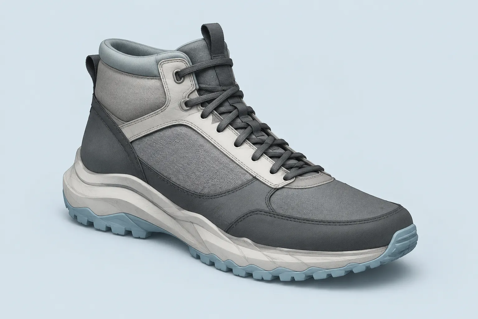
Use four dispositions:
- Approve the visual direction when the stated concept decision is legible.
- Revise when form, material, colour, or construction cues conflict.
- Request a missing view, variant, annotation, material pass, or source record.
- Hand off unresolved physical, construction, testing, manufacturing, or rights questions to the appropriate next stage.
The render establishes visual intent. It does not establish fit, comfort, durability, physical performance, manufacturing feasibility, or permission to use an asset from appearance alone.
What the Footwear Render Shows
Start with the image as evidence. Record what is visible before interpreting what the brief’s adjectives might mean.
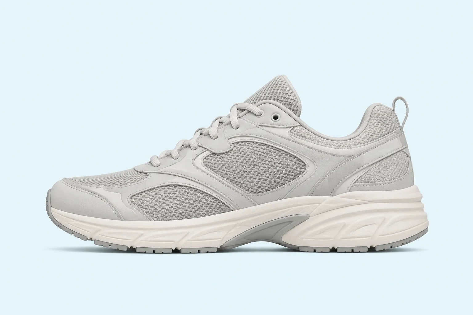
The side view usually carries the clearest silhouette read. Inspect the toe shape, heel lift, collar height, sole proportion, and upper-to-outsole relationship. These cues show a style and geometry direction; they do not confirm how the shoe will fit or behave on a foot.
Then check whether the render separates the main upper zones:
- Toe, vamp, quarter, tongue, collar, heel, and overlays
- Sole unit, foxing, midsole, outsole, and visible edge treatments
- Seams, stitch paths, fused boundaries, and panel overlaps
- Logo areas, openings, pull tabs, and other visual anchors
Panel boundaries organise the upper. They also determine where colour, texture, highlights, shadows, and construction cues appear. Research on footwear CAD has examined boundary profiles, stitching, compressed edges, wrinkles, and surface variation because these details affect how a rendered upper is read.
The practical test is direct: can another reviewer point to the same zones and describe the same intended construction? If not, the image needs clearer separation, a better camera angle, or an annotation that names the unresolved area.
How to Judge Material Cues
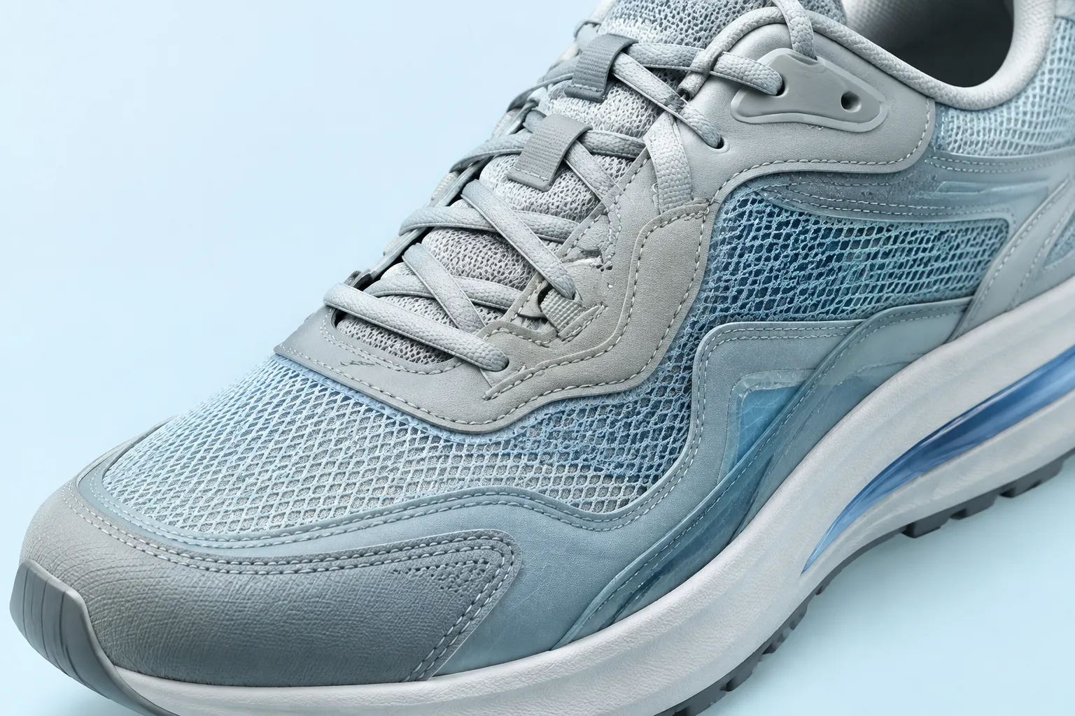
Material readability comes from surface response, not from a label such as “premium leather” or “technical mesh.” Look for visible differences in highlight width, roughness, fold behaviour, edge definition, translucency, texture scale, and compression around seams.
A useful material study should distinguish:
- Smooth and textured surfaces through different light response
- Stiffer and more flexible-looking zones through different fold cues
- Padded and thin areas through changes in volume and edge softness
- Knitted, woven, coated, and leather-like surfaces through texture and reflection
- Adjacent materials through enough contrast to remain separate at the intended viewing size
These are visual interpretations. They describe what the render suggests about a material direction, while physical deformation depends on material properties, geometry, loading, layers, and construction details. Studies of footwear materials and simulation reinforce that distinction: the image may indicate intended behaviour, but a sample or appropriately defined technical assessment is needed for physical conclusions.
Surface Response Review
- Does the highlight follow the intended form?
- Does the texture remain consistent as the surface turns?
- Do seams and edges interrupt the surface response clearly?
- Do wrinkles support a construction cue, or do they read as generic decoration?
- Do material changes remain visible under the selected lighting?
A common failure appears when every upper zone receives the same gloss, texture density, and fold pattern. The shoe may look polished, but the material story remains unresolved.
Request a revised material pass when texture is being used to imply construction without a boundary that supports that reading. Move questions about abrasion, stretch, moisture behaviour, bonding, or wear to sample inspection and technical review.
Silhouette Read and Upper Zoning
Review the shoe in a reduced view or neutral colourway before discussing colour. Strong contrast can make a weak shape appear resolved, while a quiet palette can obscure a useful form.
Check the following:
- Toe-to-heel proportion
- Forefoot volume across the available angles
- Collar and tongue relationship
- Heel counter outline
- Sole thickness and taper
- Upper-to-sole break
- Symmetry or intentional asymmetry
- Visual weight above and below the sole
Shoe-last research provides useful language for discussing toe-box shape and heel lift as visible form directions. It does not allow the render to confirm fit, comfort, or ergonomic suitability.
Use revision language that identifies the visible decision. “The toe feels too aggressive” is difficult to action. “Reduce the toe taper in the side view and add a three-quarter view to check forefoot volume” gives the team a defined change and a defined check.
Upper zoning should answer a second question: does each panel have a visible reason to exist? A boundary may carry colour, material, construction, branding, or shape emphasis. If it carries none of these, simplify it or explain its purpose in the design brief.
Colour Relationships
Colour review is about proportion and adjacency, not isolated swatches.
Compare the relative area of the main, secondary, and accent colours. Then inspect where contrast draws attention. An accent at the toe, collar, logo, or new-material zone creates a different priority from the same accent along the outsole or heel.
Record the intended relationship:
- Which zone should receive first attention?
- Which panels should read as one group?
- Which boundaries should remain quiet?
- Does contrast support the silhouette or break it apart?
- Do the variants share a recognisable blocking logic?
Colour-blocking terminology helps because the same palette can produce different results when panel proportions change. Symmetry may make a direction feel orderly; asymmetry may make it more directional. Neither is automatically correct. The choice depends on the visual priority stated in the brief.
Inspect adjacent colours and materials at their boundaries as well. A light upper beside a dark or saturated zone may create a strong edge in the render, but that edge does not establish how dyes, coatings, or materials will interact during use.
View Coverage
One attractive angle rarely answers every review question. Each additional view should remove a specific ambiguity.
- Side view: silhouette and panel flow
- Three-quarter view: volume, material transitions, and upper-to-sole relationships
- Top view: toe shape, opening geometry, and colour distribution
- Front and rear views: symmetry, heel treatment, collar alignment, and outsole width
The required set depends on the decision. Do not request a full turntable when one missing angle will resolve the issue.
Add a neutral three-quarter view and a top view. Preserve camera height, scale, lighting, and material assignments. The purpose is to review toe volume, collar opening, and vamp-overlay continuity.
Multi-view footwear design exercises commonly use front, back, side, upper, and overall views to document form. That supports a clear communication habit, not a universal approval standard. Select views according to the unresolved question.
Variant Logic and Consistency
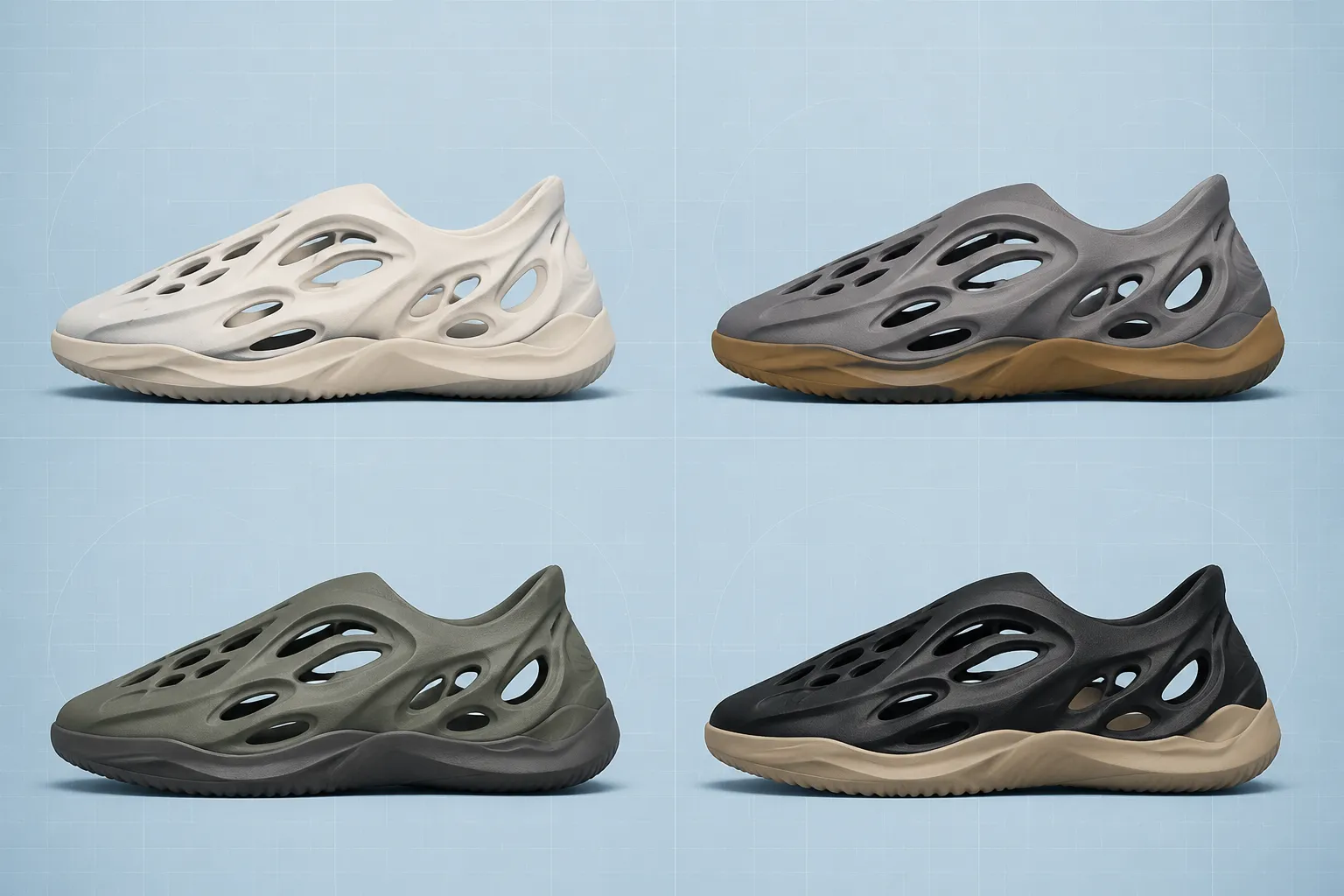
Compare variants by controlled changes. If the silhouette, camera, lighting, material, and colour all change together, the team cannot identify which difference caused the new reading.
Keep these stable where possible:
- Camera position and crop
- Shoe scale and orientation
- Light direction and intensity
- Background value
- Silhouette and panel geometry
- View naming and file version
Then vary one decision at a time: colour blocking, accent placement, material assignment, logo treatment, outsole contrast, or upper-panel emphasis.
Consistency review does not mean identical images. It checks that variants preserve the same design logic unless a change is intentional.
- Seams that move without a stated design change
- Sole proportions that differ between views
- Logo scale that changes between variants
- Textures that shift scale across the shoe
- Colour values that change under unexplained lighting differences
- Panel boundaries that disappear or appear without explanation
- Camera angles that make comparison misleading
A variant may create more contrast, but that does not make it a better product direction. The render supports a concept comparison only.
What Remains Unresolved
Mark unresolved items in the review record instead of allowing visual confidence to carry them into later decisions.
- Fit or internal volume
- Comfort or pressure distribution
- Flex behaviour
- Durability or abrasion resistance
- Material strength or stretch
- Bonding, stitching, or seam performance
- Manufacturing feasibility
- Physical colour stability or transfer
- Athletic performance
- Physical safety questions
- Market response
- Permission to use reference imagery, logos, textures, or recognisable product features
Simulation and shoe-last studies show why these questions need more than an image. Their conclusions depend on defined properties, geometry, loading assumptions, constraints, and later checking. Record the handoff in specific terms:
- Unresolved until a last and fit assessment exist.
- Unresolved until construction and material specifications are reviewed.
- Unresolved until a physical sample is inspected.
- Unresolved until appropriate testing is completed.
- Unresolved until the source record and usage permission are documented.
Compact Review Record
| Review area | Visible cue | Disposition |
|---|---|---|
| Silhouette | Toe taper and sole proportion are clear from the side. | Approve or revise the form direction. |
| Upper zoning | Overlays and seam paths separate at review size. | Approve or request clearer boundaries. |
| Surface response | Material zones differ in texture and highlight behaviour. | Approve the material direction or request a new pass. |
| Colour relationship | Accent placement directs attention as intended. | Approve the block or compare a controlled alternative. |
| View coverage | The unresolved volume or boundary is visible in another angle. | Request only the missing view. |
| Variant logic | One planned variable changes while the rest remains stable. | Compare the alternatives. |
| Source record | Reference assets and permission status are documented. | Route open rights questions for review. |
| Handoff | Each remaining question has an owner and next stage. | Send it to design, engineering, sampling, testing, or rights review. |
Do not use “looks realistic” as the final verdict. Write an observable statement instead: “The coated toe and textile quarter remain distinguishable in the three-quarter view.”
Final Disposition
Use approve when the render resolves the intended visual decision and the remaining uncertainty belongs to a later stage.
Use revise when silhouette, upper zoning, surface response, colour relationship, or variant comparison remains ambiguous.
Use request when a missing view, material pass, neutral comparison, controlled variant, annotation, or source record blocks the decision.
Use handoff when the question concerns fit, comfort, durability, performance, manufacturing, physical construction, testing, or rights. Name the receiving stage and the unresolved question in the same note.
A footwear render material review is complete when the team can state what the image shows, what it only suggests, and what evidence must come next. Approve the image for its stated visual job, then move physical and rights questions to the stage that can assess them.
Sources
- Panel rendering with perturbed boundary profiles in aesthetic shoe CAD
- Product Design Trends within the Footwear Industry: A Review
- Simulation of the behavior of the calfskin used as shoe upper material in footwear CAD
- The Influence of Materials on Footwear Behaviour: A Finite Element Simulation Study
- Modelling shape and parameterising style: an approach to the design of high-fashion shoe lasts
- Footwear Design Sketchbook Practice for a Portfolio